How to Reduce Cart Abandonment and Boost Ecommerce Sales
Dec 15, 2025
|
Published

Before you can fix your cart abandonment problem, you have to get to the root of why shoppers are leaving in the first place. Think of it less as a lost sale and more as a piece of direct, unfiltered feedback on your buying experience. And the single biggest piece of feedback? Surprise costs like shipping and taxes are killing your conversions.
Let's dig into what’s really going on when a customer walks away.
Why Shoppers Really Abandon Carts
It’s one of the most frustrating parts of running an ecommerce store. A customer spends time on your site, finds products they love, and meticulously builds their cart… only to disappear right at the finish line. This isn't just bad luck; it’s a clear signal that something in their experience broke down.

Every abandoned cart tells a story. When you start looking at this behavior as data, you can start fixing the real problems. Instead of just asking, "How do we stop people from leaving?" shift your thinking to, "What is this abandoned cart telling us about our customer's journey?" Suddenly, a frustrating metric becomes your roadmap for improvement.
To understand these stories, let's look at the data behind the most common triggers.
| Top Cart Abandonment Triggers and Their Impact |
| :--- | :--- | :--- |
| Abandonment Reason | Percentage of Shoppers Affected | Psychological Driver | | Unexpected extra costs (shipping, taxes, fees) | 48% | Sticker Shock & Broken Trust: The final price doesn't match the initial expectation. | | The site required me to create an account | 24% | Friction & Commitment Anxiety: Creates an unnecessary barrier to a simple transaction. | | Delivery was too slow | 22% | Impatience & Urgency: The perceived value of the product diminishes if the wait is too long. | | I didn’t trust the site with my credit card information | 18% | Security & Risk Aversion: Lack of trust signals and a non-professional look raise red flags. | | Complicated checkout process | 17% | Cognitive Overload: Too many steps or confusing fields lead to frustration and fatigue. |
As you can see, these aren't random occurrences. They are predictable reactions to specific friction points in the buying process.
The Psychology of Surprise Costs
The number one reason people bail is shockingly simple: they get hit with unexpected costs. A shopper has a clear price in their head when they add an item to their cart. When they finally get to checkout and see new shipping fees, taxes, or other charges tacked on, it completely shatters that mental price point.
It’s not just about the extra few dollars. It’s about the psychology of a broken promise. The price they thought they were agreeing to suddenly changes at the very last second, which immediately makes the whole transaction feel shady and erodes trust.
This is, without a doubt, the single biggest driver of lost sales. Study after study confirms it: extra costs are the top reason for abandonment. In fact, a staggering 48% of users admit to ditching their carts specifically because of these last-minute charges. You can read more about these cart abandonment statistics and see just how deeply they impact revenue.
This is why someone would rather abandon a full cart than pay a small, unexpected shipping fee. It’s the surprise, not the amount, that does the damage.
Shifting Focus From Discounts to Value
When faced with a high abandonment rate, the first instinct for many is to throw a hefty discount at the problem. A 20% off coupon might save that one sale, but it’s a dangerous game to play. You end up training your customers to always wait for a deal, which eats directly into your profit margins and devalues your brand over time.
A much smarter, more sustainable strategy is to build value into the cart experience itself.
Instead of just slashing prices, think about what you can add to make the purchase more compelling. Could you offer a free gift once they hit a certain spend? What about unlocking free shipping to encourage a slightly larger order?
This is where you can strategically nudge up your Average Order Value (AOV) while actually making your customers happier. By using a tool like Monster Cart to transform your cart from a boring summary into a dynamic rewards system, you can create incentives that feel like a genuine bonus, not a desperate bribe. This approach doesn't just cut down on abandonment—it builds loyalty and boosts lifetime value (LTV) without sacrificing your margins.
Designing a Frictionless Checkout Experience
Once you have a handle on why shoppers are bouncing, it's time to fix the scene of the crime: the checkout process itself. A clunky, confusing, or untrustworthy checkout is a guaranteed way to kill your conversion rate. Your goal should be to make buying something so effortless that your customer barely has to think.
Every single field they have to fill out, every extra click, every moment of hesitation—that’s friction. Friction is what leads to second thoughts, and second thoughts lead directly to abandoned carts. Let's look at how to strip those barriers away and create a clear, fast, and reassuring path to the "complete purchase" button.
Eliminate the Forced Account Creation
This one is a classic. Forcing a first-time buyer to create an account is like asking for a commitment on the first date. They just came to buy a product, not start a long-term relationship with your brand.
It's a huge source of friction, and the numbers back it up. A recent study found that 24% of shoppers will ditch their cart if you make them create an account. The solution is simple: always offer a guest checkout. It shows respect for their time and lets you capture a sale you would have otherwise lost forever.
Pro Tip: Let customers create an account after they've already paid. Once the transaction is complete, you can offer them the option to save their details for next time. It completely reframes the ask from a frustrating roadblock to a helpful convenience.
Streamline Your Forms and Process
Treat your checkout form like a quick, focused conversation. You only want to ask for the information that is absolutely essential to get the product to their door. Anything else is just noise.
Cut Down on Form Fields: Do you really need their phone number if you aren't using it for shipping updates? Can you use a single checkbox to make the billing and shipping addresses the same? Be ruthless here.
Use Autofill and Address Validators: Tools that auto-complete addresses as someone types are a lifesaver. They not only speed things up but also drastically cut down on costly shipping errors from typos.
Show a Progress Indicator: A simple visual bar showing where they are in the process (e.g., Shipping > Payment > Confirm) works wonders. It manages expectations and makes the whole journey feel shorter and more organized.
Offer Diverse Payment Options
Today's shoppers expect to pay how they want to pay. If you only offer a single way to check out, you're practically inviting a huge chunk of your audience to shop elsewhere.
At a minimum, you should be offering:
Digital Wallets: Apple Pay and Google Pay are the gold standard for frictionless, one-click payments, especially on mobile.
"Buy Now, Pay Later" (BNPL): Services like Klarna or Afterpay can be a game-changer for higher-priced items, breaking the cost into smaller, more manageable payments.
Standard Credit Cards: Of course, you need to accept all major cards. Make sure to display the logos (Visa, Mastercard, Amex) clearly to build instant trust.
Adopt a Mobile-First Design
This isn't really optional anymore. More than half of all ecommerce traffic comes from phones, yet so many checkout flows feel like they were squished down from a desktop design as an afterthought.
A true mobile-first approach is essential. This means big, tappable buttons, simple forms that are easy to fill out on a tiny keyboard, and a page that loads lightning-fast on a mobile connection.
Ultimately, designing a great checkout is about more than just looks; it's about psychology. A crucial part of this is doing proper usability testing of a website to improve UX to find the hidden pain points you’re blind to. Watching real people try to buy from you is the fastest way to uncover all the little frustrations that are quietly costing you sales.
Turn Your Cart Into a Conversion Machine
Most store owners see the shopping cart as a simple holding area—a final summary before the customer heads to checkout. But that's a massive missed opportunity. It’s time to stop thinking of your cart as a static list and start treating it like your most powerful marketing tool. This is where you can turn a hesitant shopper into an excited buyer.
The typical knee-jerk reaction to cart abandonment is to blast out a site-wide, hefty discount. Sure, a 20% off coupon might save a sale today, but it's a dangerous habit. You're training customers to expect deals, which slowly eats away at your profit margins and cheapens your brand over time. There's a much smarter, more sustainable way: build value directly into the shopping experience.
The Magic of Progressive In-Cart Rewards
The real secret to slashing abandonment while boosting your Average Order Value (AOV) is using progressive rewards. It's a simple but powerful concept: customers unlock better perks the more they spend. This turns shopping into a sort of game, giving them a compelling reason to add just one more item to their cart.
Imagine this: a customer adds a product. Instantly, a progress bar appears in their cart, showing they're only $10 away from free shipping. That little nudge is often all it takes to get them browsing for a small add-on. As soon as they hit the free shipping goal, the bar resets with a new, even more tempting offer: "Spend $75 to get a free gift!"
This creates a positive feedback loop. Instead of getting hit with unexpected shipping fees at the end (a top reason for abandonment), they feel rewarded for spending more. You're not just selling products; you're crafting an experience that makes shoppers feel like they're getting a great deal.
Go From Static Summary to Interactive Experience
To pull this off, you need a tool that can handle this kind of dynamic, in-cart experience. This is where an app like Monster Cart comes in. It replaces the default Shopify cart with a fully branded, interactive slide-cart that builds this reward system right into your store. The offers feel like a natural part of the shopping flow, not an annoying pop-up.
These systems go way beyond basic upsells. They let you build a multi-tiered reward structure that guides the customer along a path to spending more. Here's what that can look like in action:
Tier 1: Spend $50 → Unlock Free Shipping.
Tier 2: Spend $75 → Get a Free Travel-Size Product.
Tier 3: Spend $100 → Add a Deluxe Sample Pack.
Tier 4: Spend $150 → Unlock a small discount on the entire order.
This is all about creating a frictionless path from cart to checkout, which is the ultimate goal.
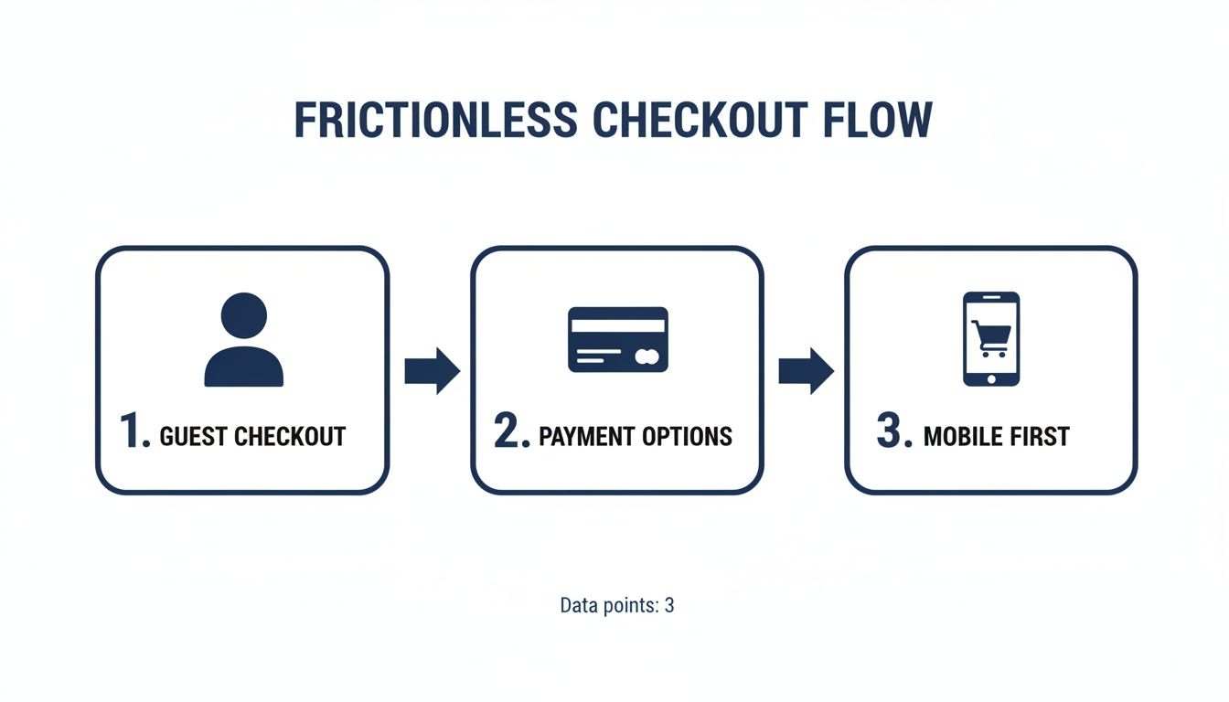
As this graphic shows, a seamless checkout experience relies on key elements like guest checkout, multiple payment options, and a mobile-first design—all of which are complemented by a cart that motivates the user to complete their purchase.
Think Bigger Than Just One Sale
This strategy does more than just plug the hole of cart abandonment; it fundamentally improves your relationship with customers and your long-term profitability. You start focusing on Lifetime Value (LTV) instead of just scrambling for the next conversion.
When you consistently deliver value through rewards rather than just slashing prices, you build genuine brand loyalty. People remember the great experience of getting a free gift, and that makes them far more likely to come back. You're building a sustainable growth model, not just a series of low-margin, one-and-done sales.
By transforming your cart, you’re not just preventing a negative outcome (abandonment); you’re actively creating a positive one (higher AOV and loyalty). It’s the difference between plugging a leak and building a stronger ship.
An interactive cart also gives you the perfect place to offer other value-adds without cluttering up your product pages. You can seamlessly weave in things like:
One-Click Add-ons: Offer shipping protection or priority processing right in the cart.
Personalized Recommendations: Show them products that go perfectly with what they're already buying.
"Frequently Bought Together" Bundles: Suggest curated product sets that offer more value.
Getting your on-site experience right is the foundation of a healthy business. If you’re ready to dig in even deeper, check out our guide to shopping cart optimization. Turning your cart into your best salesperson is the single most proactive step you can take to not only solve abandonment but to build a more profitable brand.
Building Unshakable Trust at Checkout
In the often-anonymous world of ecommerce, trust isn't just a nice-to-have; it's your most valuable currency. Think about it: a customer at your checkout page is at their most vulnerable. They're about to hand over their hard-earned money and personal information. Any hint of uncertainty can send them scrambling for the “back” button.
This is why building unshakable trust right at the checkout is so fundamental. It’s all about strategically placing signals that reassure them they're making a smart, safe decision.
A lack of trust is a major conversion killer. In fact, a staggering 18% of shoppers will ditch a cart just because they don't trust the site with their credit card info. That's nearly one in five potential sales lost to doubt. Let's fix that.
Display Security Badges Prominently
Your customers aren't cybersecurity experts, but years of online shopping have trained them to look for visual cues of safety. Simply adding recognizable logos and badges from trusted names can have a massive psychological impact, easing anxiety at the exact moment it peaks.
These aren't just decorative icons; they are powerful reassurances. Make sure you prominently display:
SSL Certificates: Logos from providers like Norton or GeoTrust instantly signal that the connection is encrypted and their data is safe from prying eyes.
Payment Provider Logos: Familiar icons like Visa, Mastercard, PayPal, and Apple Pay show that you work with established, secure financial institutions they already trust.
Placement is everything here. These badges do the most good when placed directly near the payment fields and the final "Complete Purchase" button.
Leverage the Power of Social Proof
Nothing builds confidence faster than seeing that other people have already bought from you and had a great experience. This is the magic of social proof, and it's your best tool for calming the nerves of a first-time buyer.
Don't bury your best reviews on a separate page where they’ll never be seen. Instead, weave them directly into the buying journey. For instance, a short, 5-star review snippet or a customer photo popping up near the "Add to Cart" button or within the cart itself can be incredibly effective.
When a new shopper sees that hundreds of others have already trusted you, their perceived risk plummets. It transforms the purchase from a leap of faith into a well-vetted decision.
This is a tactic that fits beautifully into a dynamic cart experience. A tool like Monster Cart, for example, can be set up to show these trust signals directly within the slide-out cart, reinforcing confidence without disrupting the customer's flow to checkout.
Make Your Policies Clear and Accessible
Hidden policies are a huge red flag. If a shopper can't easily find information about your returns, shipping, or privacy, they'll just assume the worst. For today's savvy customers, transparency is completely non-negotiable.
Your return policy, in particular, should be incredibly easy to find and understand. A complicated or restrictive policy creates purchase anxiety, making customers hesitate to buy something they might get stuck with.
To build that crucial confidence, make sure your policies are:
Easy to Find: Link to them clearly in your site's footer, on product pages, and even in the cart summary. Don't make them hunt for it.
Simple to Read: Ditch the dense legal jargon. Use plain, simple language to explain the process for returns and refunds.
Customer-Friendly: A generous and clear policy acts as a safety net, giving shoppers the confidence they need to complete their purchase.
For a solid example of how to structure this, you can learn more about crafting a transparent and customer-centric refund policy that builds trust from the ground up. By being upfront and clear, you remove one of the final barriers to conversion and show customers you proudly stand behind your products.
Recapturing Revenue with Smart Follow-Up Campaigns
Let's be realistic: even with a perfectly streamlined cart and checkout, life gets in the way. A phone call, a spotty Wi-Fi connection, a kid needing a snack—any of these can pull a shopper away just as they’re about to buy.
But an interrupted session doesn't have to be a lost sale. This is where a smart follow-up campaign becomes your secret weapon for bringing high-intent customers right back to where they left off. The trick is to move past the generic, one-size-fits-all "You left something in your cart!" message. A well-timed sequence of emails and SMS messages can feel more like a helpful nudge than a hard sell, turning a near-miss into a loyal customer.
Crafting a Multi-Step Recovery Sequence
A single abandoned cart email is a decent starting point, but a multi-step sequence is where the real magic happens. It gives you the space to build on your message and escalate the incentive over time, all without giving away your best offer right out of the gate. Think of it as a friendly conversation that gently guides the customer back.
Here’s a proven framework that works incredibly well:
Follow-Up 1 (1-4 hours after abandonment): The Gentle Reminder. Keep this first touchpoint simple and customer-focused. You're just trying to jog their memory and make it dead simple to get back to their cart. A subject line like "Did you forget something?" or "Your items are waiting" is perfect.
Follow-Up 2 (24 hours after abandonment): Highlight Benefits & Scarcity. If the first email didn’t seal the deal, it’s time for a new angle. Remind them what’s so great about the products in their cart or create a little urgency by mentioning that popular items are selling out.
Follow-Up 3 (48-72 hours after abandonment): The Strategic Incentive. This is your last, best shot. But instead of jumping straight to a hefty discount that eats into your profit, consider offering something else of value. Free shipping, a free gift, or a small discount are often more powerful motivators and much better for your margins than a standard 10% off coupon.
This tiered approach is smart because it protects your profitability. It gives customers a chance to convert on their own terms first, which is key to building genuine loyalty instead of just training them to wait for a discount.
If you really want to dig into the nitty-gritty, there are tons of proven strategies for abandoned cart emails that can help you dial in your messaging.
Personalization and Timing Are Everything
The success of your recovery campaign really boils down to two things: personalization and timing. Get these right, and an automated email transforms from potential spam into a genuinely helpful interaction.
Your emails should always pull in the exact items the shopper left behind—product images, names, the whole deal. That flash of recognition makes the message feel personal and instantly reminds them of what they were so close to buying.
Timing is just as critical. The data doesn't lie: sending that first email within an hour of abandonment consistently delivers the best results. The shopper’s intent is still fresh, and you have a much better chance of catching them while they're still in that "buying" frame of mind.
Connecting Follow-Ups to Lifetime Value
While the immediate goal is obviously to recover that sale, a good follow-up campaign plays a much bigger role in your business: increasing customer lifetime value (LTV). Every single interaction is a chance to build a stronger relationship.
When you offer thoughtful perks like a free gift on their next purchase or free shipping instead of a generic discount, you’re teaching customers to see value beyond just the price. This strategy ties in perfectly with in-cart rewards, like the kind you can create with an app like Monster Cart.
Imagine a shopper who abandoned a cart that had a free gift unlocked. An email reminding them of that specific perk creates a seamless, compelling reason to come back and finish the order. You're not just saving a sale; you're building a brand experience people love.
Turning Data into Dollars: How to Optimize Your Strategy
You can't fix a leak if you don't know where it's coming from. After you've rolled out new designs, beefed up your trust signals, and added in-cart rewards, the real work begins: tracking your results and fine-tuning your approach.
This is the part of the process that separates the stores that consistently grow from the ones that just get by. It’s about moving beyond guesswork and making smart decisions based on what your customers are actually doing.
The Numbers That Really Matter
To get a clear picture of what's working (and what's not), you need to keep an eye on a few key performance indicators (KPIs). These are your store's vital signs.
Focus on these three to start:
Cart Abandonment Rate: This is your big-picture metric. It’s simply the number of completed purchases divided by the number of carts created. A high rate here often points to problems happening before checkout, like sticker shock or a confusing user experience.
Checkout Abandonment Rate: This one zooms in on the finish line. It tells you how many people start filling out their shipping and payment info but bail before clicking "buy." High numbers here usually scream "unexpected shipping costs!" or "forced account creation!"
Recovery Campaign Conversion Rate: Are your abandonment emails and texts actually bringing people back? This metric tells you exactly how well your follow-up strategy is performing. It's a direct measure of your success in winning back lost sales.
A great first step is setting up these KPIs in a tool like Google Analytics. But don't just stare at the numbers. Dig into the funnel visualization reports to see the exact page where people are dropping off. Is it the shipping page? The payment page? Finding that weak link is half the battle.
From Insights to Action: The Power of A/B Testing
Once you have your baseline data, it's time to experiment. This is where A/B testing (or split testing) comes in. It's a straightforward concept: show two different versions of a page or an offer to two different groups of visitors and see which one wins.
This is how you turn your data into real, measurable improvements. Forget about overhauling your entire site at once. Small, focused tests are the way to go because they let you know precisely what's making a difference.
For instance, you could test:
Reward Thresholds: Does a "$50 for free shipping" offer convert better than "$60"?
Call-to-Action (CTA) Buttons: Does "Secure Checkout" get more clicks than "Complete Purchase"?
In-Cart Offers: Does a free gift at $75 drive a higher AOV than a 10% discount at $100?
This approach fits perfectly with a value-driven strategy. Instead of just throwing hefty discount codes around, you can experiment with different rewards that increase both your conversion rate and your Average Order Value (AOV).
This is where a tool like Monster Cart really shines. It lets you easily set up and test different in-cart reward structures. You can quickly see which incentives—like a free gift versus a tiered discount—not only cut down on abandonment but also get shoppers to spend more, boosting their lifetime value (LTV) in the long run.
This cycle of measuring, testing, and optimizing is the engine that drives sustainable growth. If you're ready to go even deeper, our comprehensive Revenue Optimization Course gives you a full playbook for turning data into profit. By adopting this methodical approach, you can systematically plug the leaks in your funnel and build a much more resilient business.
Have Questions? We Have Answers.
Running into a wall with cart abandonment? You're not alone. Here are some quick, practical answers to the questions we hear most often from fellow Shopify merchants.
How Can I Reduce Cart Abandonment Without Just Slashing Prices?
This is a big one. It's tempting to throw a 20% off coupon at the problem, but that's a race to the bottom that eats your margins and trains customers to wait for a sale. The real solution is to shift your mindset from discounting to adding value.
Instead of giving something away, make customers feel like they're earning something. A tiered reward system using free gifts, free shipping, and smaller discounts is brilliant for this. Start with free shipping at a certain spend, then maybe a free gift at the next level up. This strategy tackles the surprise shipping fee issue head-on while also nudging your Average Order Value (AOV) in the right direction and focusing on long-term lifetime value (LTV). It's about making shoppers feel smart for spending more with you.
What's the Very First Thing I Should Do to Lower My Abandonment Rate?
Before you do anything else, go through your own checkout process with a critical eye. Where does it feel clunky? Where are the roadblocks? More often than not, the biggest culprit is unexpected costs showing up at the last second. Be upfront about shipping and taxes way earlier in the process.
After that, your single biggest win is enabling guest checkout. Seriously. Forcing a first-time buyer to create an account is like asking for a commitment on the first date—it's just too much, too soon. Removing that one hurdle is often the fastest way to see an immediate lift in conversions.
The Golden Rule: Make buying from you as effortless as possible. Don't ask for any more information or effort than what's absolutely essential to complete the purchase.
Is It Possible to Increase AOV and Reduce Abandonment at the Same Time?
Absolutely, and this is where the magic happens. The trick is to turn your shopping cart into an interactive, motivating experience that focuses on value-adds, not hefty discounts.
Think about using a dynamic progress bar right in the cart with a tool like Monster Cart. It visually shows shoppers exactly how close they are to unlocking their next reward, whether it's free shipping, a free gift, or a small discount. As they drop more items in, the bar fills up. This gamifies the experience and makes them want to add that one extra item to hit the goal. You’re not just preventing abandonment; you’re actively encouraging a bigger spend, boosting AOV and building a relationship that fosters higher lifetime value.
Ready to turn your cart from a leaky bucket into your best salesperson? Monster Cart helps you build a high-converting, interactive rewards experience that boosts AOV and delights customers. Learn more about Monster Cart and start turning abandoned carts into loyal fans today.
Join 7000+ brands using our apps


