Boost AOV and Conversions by customize shopify checkout page
Feb 9, 2026
|
Published

You can absolutely customize your Shopify checkout page to match your brand's colors and logo, right inside the Shopify editor. For deeper changes, Shopify Plus unlocks more powerful tools, and a whole ecosystem of apps lets you add features like upsells and rewards.
Why Your Default Checkout Is Leaving Money on The Table
That standard Shopify checkout is clean, reliable, and gets the job done. But let's be honest—it’s also a huge missed opportunity. It’s a generic endpoint to what should be a unique, branded experience, and that disconnect is likely costing you sales.
The journey from adding a product to the cart to finalizing the payment should feel like a seamless extension of your store, not a sudden handoff to a faceless processor. When customers land on a checkout page that doesn't reflect your brand's look and feel, it creates a flicker of doubt. Is this legit? Am I in the right place? That tiny crack in confidence is often all it takes to send them looking for the exit.
The goal isn't just to take their money. It's to reinforce trust and make the final step feel just as secure and familiar as browsing your product pages.
This is where merchants often panic, throwing last-minute, margin-killing discount codes at hesitant buyers to push them over the finish line. There’s a much smarter way. Instead of eroding your profits, you can build value directly into the buying process with incentives that encourage customers to spend more while feeling like they got a fantastic deal.
The True Cost of an Unoptimized Checkout
The numbers paint a pretty stark picture. Picture this: for every 100 shoppers who add something to their cart on your store, 70 of them just leave. That 70.19% cart abandonment rate contributes to a staggering $260 billion in lost revenue across e-commerce every single year.
But there's good news. Brands that take the time to optimize their checkout—tailoring the layout with a logo, brand colors, and trust badges—often report conversion rate jumps of 15-35% within just 60-90 days. You can dive deeper into the data and see how merchants are flipping the script with smart customizations from our friends at BlackBelt Commerce.
Here’s the default Shopify branding that serves as the starting point for most stores.
It's functional, sure. But it lacks the unique brand identity that builds the trust needed to encourage both an initial purchase and higher spending.
Shifting Focus to Lifetime Value
Your checkout page is the final handshake, your last chance to make a lasting impression. By focusing on customization, you're not just plugging a leaky sales funnel; you're building a much stronger foundation for long-term customer relationships.
The real win isn't a single transaction. It's creating an experience so smooth and rewarding that customers are excited to come back. This is how you transition from chasing one-off sales to building sustainable, long-term growth.
Instead of generic discounts that train customers to wait for sales, think about value-driven rewards that feel earned:
Free Shipping Tiers: Motivate customers to add just one more item to their cart to unlock that sweet, sweet free shipping.
Exclusive Free Gifts: Offer a desirable gift with a minimum spend, creating a sense of exclusivity and delight.
Tiered Rewards: Implement a model that rewards shoppers for building bigger carts, encouraging higher spend without deep discounts.
These tactics not only increase your immediate average order value (AOV) but also improve the customer's perception of your brand, setting the stage for future purchases. At the end of the day, the goal of customizing your Shopify checkout is to boost sales. For a broader look at this, it's worth exploring how to improve website conversion rates.
Quick Wins for Your Standard Shopify Checkout
You don’t need to be on Shopify Plus or hire a developer to make some serious improvements to your checkout. Even on a standard Shopify plan, there are plenty of tweaks you can make right now to build trust, reinforce your brand, and create a much smoother path to purchase.
Think about it from the customer's perspective. They've browsed your site, fallen in love with a product, and are ready to buy. They click "checkout" and suddenly land on a page that looks... different. The font is off, the colors clash, and your logo is nowhere in sight. It’s jarring. That little moment of visual disconnect is enough to make them pause and wonder, "Am I still on the right site?"
That hesitation is a conversion killer. By simply adding your logo and matching your brand's color palette, you're sending a powerful signal of trust and professionalism right when it matters most.
This single decision—to customize or stick with the default—has a huge impact on whether that shopper completes their purchase or just walks away.
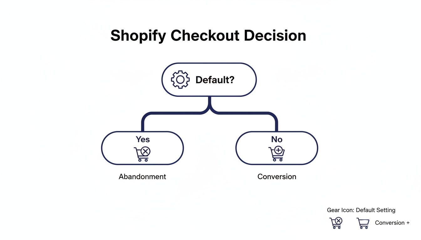
As you can see, leaving the checkout on its default settings is a direct path toward cart abandonment. A little bit of customization goes a long way.
Instantly Improve Your Checkout Branding
Your first stop should be the Shopify theme editor. This is where you can make some of the most impactful visual changes without ever touching a line of code.
Here’s what you can knock out in a few minutes:
Logo Placement: Add your brand’s logo to the checkout header. This is probably the single most important trust signal you can add.
Color Scheme: Tweak the colors of buttons, links, and accents to perfectly match your brand's established palette.
Typography: Choose fonts that are consistent with the rest of your storefront to maintain that cohesive brand experience.
These aren't just cosmetic changes. They are psychological cues that tell your customer your business is legit, professional, and cares about the details. A well-branded checkout just feels safer.
Configure Your Checkout Settings
Beyond the look and feel, Shopify's native settings give you several ways to fine-tune the actual checkout flow and cut down on friction.
Customer Accounts You need to decide how you want customers to check out: as guests, or by creating an account. My advice? Make accounts optional. Forcing account creation is a well-known conversion killer and a top reason for abandoned carts.
Form Options Keep your forms as lean as possible. Only ask for the information you absolutely need to process and ship the order. Every extra field is another chance for a customer to get annoyed and leave. Make the "Company name" field optional, and really think about whether you need a phone number.
Tipping If it makes sense for your brand—maybe you're a service-based business or have a strong community vibe—you can enable a tipping option. It's a nice way to let happy customers show their appreciation.
Key Takeaway: The goal with these quick wins is to remove any shred of doubt or hesitation. A checkout that looks and feels like a natural extension of your brand is a checkout that converts.
This isn't just theory; the numbers back it up. Shopify powers 10% of all U.S. e-commerce, and their data shows that personalized checkouts can boost first-purchase conversions by 22% and repeat purchases by 31%.
While these native settings are a fantastic start, the real magic for boosting your Average Order Value (AOV) often happens before the customer even gets to this page. By optimizing the cart experience with a tool like Monster Cart, you can introduce value-driven rewards like free shipping thresholds and gifts with purchase. This encourages customers to build a bigger, more valuable cart long before they start typing in their payment details.
Boost AOV Before The Checkout with An Optimized Cart
If you want to customize your Shopify checkout page, the most effective tweaks often happen one step before a customer ever gets there. The real opportunity to boost your average order value (AOV) isn't on the final payment screen; it's in the cart, where buying decisions are still being made.
Too many merchants resort to disruptive pop-ups or confusing discount codes to upsell. These tactics can feel aggressive and often lead to customers abandoning their carts altogether. A far better approach is to transform your cart from a simple list of products into an interactive, rewarding experience. This is where a slide-out cart, or "cart drawer," really shines.
Instead of yanking customers off a product page and redirecting them to a separate cart page, a slide-out cart keeps them in the flow. The experience is seamless, maintaining their shopping momentum and creating the perfect moment to introduce incentives that encourage them to add just one more thing.
Shift from Discounts to Value-Driven Rewards
Relying on constant discounts can be a dangerous game. You end up training customers to wait for a sale, which slowly chips away at your profit margins and brand value. The smarter play is to focus on rewards that add value to the purchase, making customers feel like they’ve earned a special perk.
This strategy is all about building lifetime value. A customer who gets a free gift they genuinely love is far more likely to come back than someone who just got 10% off. You're creating a memorable moment, not just processing a transaction.
Here are a few powerful reward strategies you can build right into the cart:
Free Shipping Progress Bar: A classic for a reason. Showing a visual bar that tells customers, "You're just $12 away from free shipping!" is a massive psychological motivator. It gamifies the experience and makes the goal feel achievable.
Tiered Free Gifts: Don't stop at just one offer. You can create multiple reward tiers, like "Spend $50 for a free sticker pack" and then "Spend $100 for a free tote bag." This gives customers a clear goal to aim for and encourages bigger orders.
"Buy More, Save More" Incentives: Offer progressive savings that scale with the cart total. This directly rewards customers for placing larger orders without having to apply a blanket discount to your entire catalog.
This approach turns the cart into a dynamic rewards hub. The simple act of adding a product becomes an engaging game where shoppers can unlock new perks.
The Power of an Optimized Cart Drawer
An optimized cart experience isn't just about what you offer; it's about how you present it. This is where tools like Monster Cart become essential. They replace Shopify's default cart with a sleek, fully-brandable slide-out drawer that integrates these AOV-boosting features right into the shopping flow.
Take a look at how Monster Cart can turn a standard cart into an interactive rewards engine.
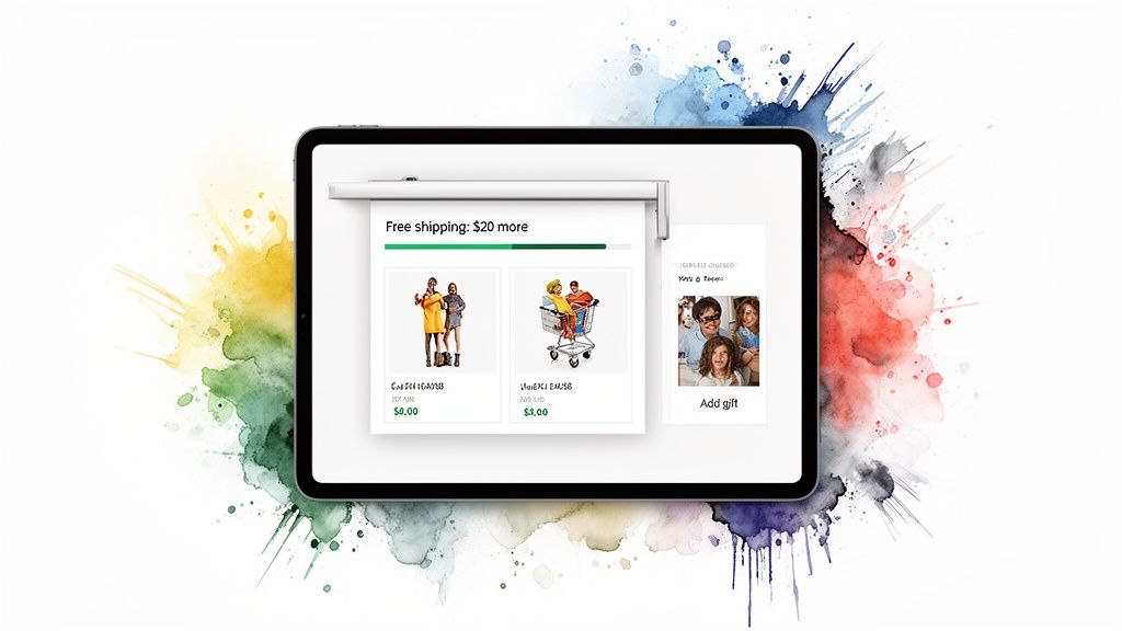
This screenshot shows exactly how an optimized cart can visually display progress toward free shipping while tempting shoppers with gift-with-purchase options. It encourages them to increase their order value before they even think about the final checkout step.
By the time a customer clicks "Checkout," their order value should already be maximized. The cart is your final sales floor—use it to delight your customers with value, not just process their items.
When done right, this feels less like a pushy upsell and more like helpful guidance. You’re not just selling products; you’re helping customers get the best possible deal. To learn more about how small tweaks can lead to big results, check out our guide on how to improve your e-commerce conversion rate.
Adding Seamless In-Cart Upsells
Beyond rewards, a smart cart drawer is the perfect home for relevant, one-click upsells that don't interrupt the shopping journey. Because these offers appear within the context of what the customer is already buying, they feel natural and genuinely useful.
Consider adding these types of offers:
Frequently Bought Together: Suggest complementary products that make perfect sense. If someone is buying a camera, offering a memory card is a no-brainer.
One-Click Add-ons: Offer low-cost, high-value additions like shipping protection, product warranties, or priority processing. These are easy "yes" decisions that can significantly pad your AOV.
Personalized Recommendations: Use app logic to suggest other products the customer might love based on their cart's contents, turning a good order into a great one.
The key is to make these offers frictionless. A customer should be able to add them with a single click without ever leaving the product page. This combination of value-driven rewards and relevant upsells, all housed within a beautifully branded cart drawer, creates a powerful engine for growth. It shifts the focus from a static checkout page to a dynamic pre-checkout experience that drives higher AOV and builds lasting customer loyalty.
Advanced Checkout Customization with Shopify Plus
When you're running a high-growth brand on Shopify Plus, you're playing in a different league. The ability to customize your Shopify checkout page goes way beyond just slapping your logo on it. This is where you get to craft a truly bespoke experience that feels like a natural extension of your business, creating a frictionless final step that actually boosts conversions.
While the standard Shopify plans give you the essential branding tools, Shopify Plus is all about fundamentally changing how your checkout functions. This is now done through a modern, upgrade-safe framework called Checkout Extensibility. It's the official, more robust replacement for the old checkout.liquid file, and it lets you add powerful apps and custom features right into the checkout flow without that nagging fear that a future Shopify update will break everything.
The Power of Checkout Extensibility
Think of Checkout Extensibility as a set of secure, pre-approved building blocks for your checkout. It allows you to inject new UI elements and your own business logic at very specific points in the process. This means you can create a unique journey tailored to what your customers actually need, all while maintaining the rock-solid security and performance of Shopify’s core checkout.
This modern approach lets you move past simple color swaps and add real, meaningful functionality. Instead of just relying on discounts to drive a sale, you can build value and convenience directly into the payment process, encouraging higher lifetime value from the start.
Here are a few real-world examples of what suddenly becomes possible:
Custom Fields: Need to add a field for a personalized gift message, special delivery instructions, or maybe an engraving request? You can do that now.
Loyalty Program Integration: Let customers see and redeem their loyalty points for a free gift or a dollar-off reward directly at checkout. It's a seamless experience that feels truly integrated.
Dynamic Content: Display unique banners or messages based on what’s in the cart, like showing an estimated delivery date for a specific product or a warning about final sale items.
These aren't just minor tweaks; they're functional upgrades that genuinely improve the customer experience and can even streamline your backend operations.
The real goal with Shopify Plus isn't just to make the checkout look like your brand, but to make it work like your brand. It’s all about building a flow that feels intuitive and perfectly suited to what you sell and who you sell to.
Adding Sophisticated Logic with Shopify Scripts
Beyond the visual and UI additions, Shopify Plus also gives you access to Shopify Scripts. These are small bits of code that run on Shopify's servers, letting you implement custom logic for things like pricing, shipping, and payments. While Scripts are slowly being phased out in favor of the newer Shopify Functions, they're still an incredibly powerful tool for many merchants.
With Scripts, you can create complex, intelligent promotions that go way beyond a simple discount code. This is your chance to reward customers for building bigger carts without devaluing your products with constant "20% Off!" sales.
Imagine automatically implementing offers like these:
Automatic BOGO: Set up "buy one, get one free" deals that just happen when a customer adds the right items to their cart. No code needed.
Tiered Discounts: Create a "spend $100, get 10% off; spend $200, get 20% off" promotion that updates in real-time as the customer shops.
Gift with Purchase: Automatically add a free gift to the cart once a certain spending threshold is met.
This level of automation feels almost magical to a customer. Shoppers are delighted by unexpected rewards, which is a proven way to boost your AOV and build the kind of loyalty that lasts.
A Cohesive Strategy from Cart to Checkout
While Shopify Plus gives you an incredible toolkit for the final checkout page, don't forget that the customer's journey starts way before that. The most successful brands I've seen combine these advanced checkout customizations with a highly optimized cart experience.
By using a tool like Monster Cart, you can introduce those value-driven rewards—like free gifts and shipping progress bars—long before the customer even thinks about paying. This pre-checkout optimization ensures the customer arrives at the final step with a maximized cart value, fully primed to convert.
Then, the custom features you’ve built on your Plus checkout page can seal the deal with a seamless, trustworthy, and perfectly branded finale.
Turn Your Thank You Page Into a Retention Tool
The moment a customer clicks "Complete Order" isn't the end of their journey; it's the beginning of the next one. Too many merchants treat the thank you page like a simple receipt, but it's actually prime real estate for building loyalty and securing future sales.
Think of it as your first, and best, chance to turn a one-time buyer into a lifelong fan.
Instead of a generic confirmation, you can customize this page to immediately re-engage your new customer while they're still feeling that post-purchase high. This is the perfect time to make a relevant follow-up offer without being pushy. The key is to add genuine value that deepens their connection to your brand, not just offer another discount.
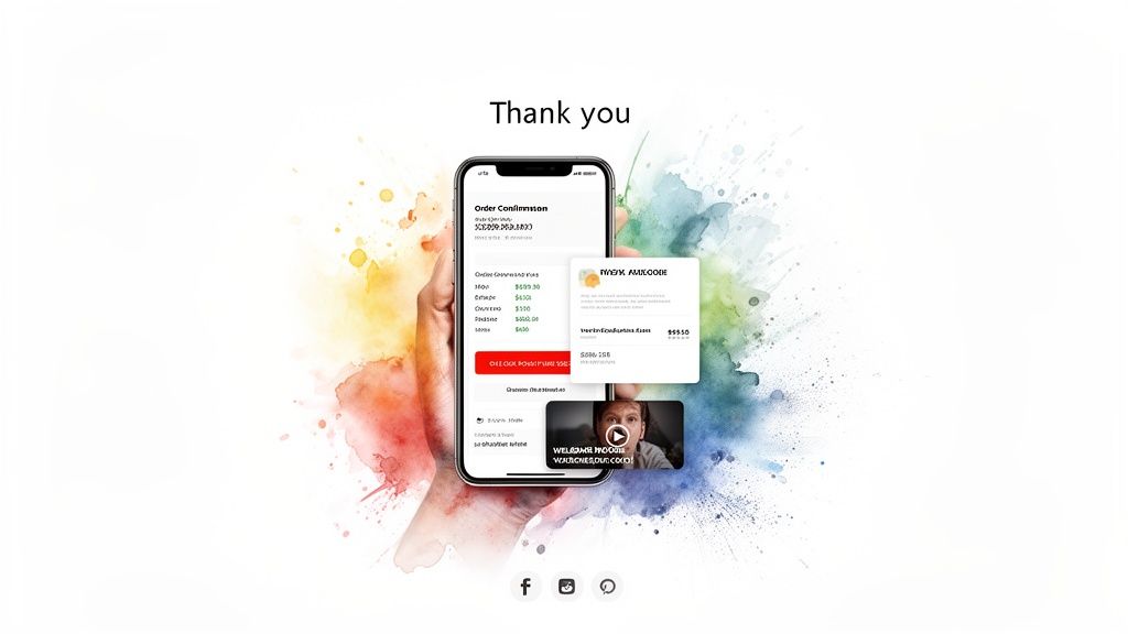
This is a critical touchpoint. A customer just placed their trust (and their money) with you. A well-designed thank you page validates that decision and proves the great experience doesn't stop at checkout.
Drive Immediate Repeat Purchases with Post-Purchase Upsells
One of the most effective ways to customize your Shopify checkout page experience is with a post-purchase upsell app. These tools let you present a compelling, one-click offer after the initial payment is complete but before the customer leaves the page.
Because their payment information is already saved, they can accept the new offer with a single click. There's zero friction. It's the ideal spot to suggest a complementary product that makes their original purchase even better.
Here are a few value-driven ideas:
Complementary Products: If they bought a coffee maker, offer a bag of your best-selling beans or a set of custom mugs.
A "Try Me" Size: Pitch a sample-sized version of another popular product for a small extra cost.
An Exclusive Item: Present a product that's only available as a post-purchase add-on, creating a sense of urgency and exclusivity.
This strategy respects the initial transaction while intelligently increasing the total order value. You can find more ideas by exploring some of the best Shopify upsell apps available.
The thank you page is your victory lap. Use it to reinforce the customer’s smart decision and give them another reason to love your brand, setting the foundation for long-term loyalty.
Fostering a Lasting Connection Beyond the Sale
Increasing your Average Order Value is important, but building a community is what creates sustainable growth. Your thank you page is the perfect platform to invite customers deeper into your brand's world.
Think beyond just selling more products and focus on creating a real connection. You can add elements that encourage long-term engagement and turn new customers into brand advocates.
Consider adding these to your order confirmation screen:
A Welcome Video: Record a short, personal video from the founder thanking them for their purchase. This humanizes your brand and makes a memorable impression.
Social Media Follows: Add prominent buttons encouraging them to follow you on Instagram, TikTok, or Facebook for exclusive content and community updates.
Referral Codes: Offer them a unique code to share with friends. When a friend makes a purchase, both of them get a reward like store credit or a free gift.
This approach transforms a transactional page into a relational one. You're not just confirming an order; you're welcoming them to the family.
Your Checklist for a High-Converting Checkout
Alright, we've covered a ton of ground, from quick branding tweaks to the heavy-duty power of Shopify Plus. Now, let's bring it all together. Think of this as your final pre-flight checklist before launching any changes, grounding your strategy in battle-tested principles that actually move the needle.
First things first: speed. A gorgeous checkout that takes forever to load is completely useless. Your absolute number one priority has to be lightning-fast load times, especially on mobile where most of your customers are shopping. Every single second of delay is a direct hit to your sales.
Right alongside speed is simplicity. You have to minimize friction by stripping your forms down to the bare essentials. If you don't absolutely need a piece of information to fulfill the order, don't ask for it.
Build Unshakeable Trust and Transparency
Trust is the currency of e-commerce. You earn it by being crystal clear and constantly reassuring customers that they’re making a safe, smart choice. Last-minute surprises are the number one reason people abandon carts. Period.
Be Upfront with Costs: Nobody likes getting hit with unexpected fees at the last second. Display all shipping costs, taxes, and any other charges clearly and early in the process. A study found that 48% of shoppers ditch their carts for this exact reason.
Showcase Security: Don't make customers guess if your site is secure. Prominently display trust badges (like McAfee or Norton) and the logos of payment methods you accept. These visual cues scream safety and professionalism.
Offer Express Payments: Make it ridiculously easy for people to give you their money. Integrating one-click options like Shop Pay, PayPal, and Apple Pay lets customers fly through checkout, skipping all the tedious form-filling that kills conversions.
Remember, a customer's decision to buy is an emotional one backed by logic. Your checkout's design must appeal to both. It needs to feel safe, look professional, and be incredibly simple to navigate.
Always Test Your Changes
Never assume a change will work just because it's considered a "best practice." The only truth in e-commerce comes from your own data. The only way to know for sure what resonates with your audience is to test everything.
Use A/B testing tools to experiment with different button colors, calls-to-action, or even where you place your trust badges. Let the data guide your decisions. This constant cycle of testing and refining is what separates the good checkouts from the great ones.
To make sure your checkout is part of a bigger, more cohesive strategy, it’s worth exploring these key conversion rate optimization best practices that cover your entire sales funnel. Ultimately, a successful checkout is a living thing—one that evolves with your customers, turning data-driven insights into higher revenue and greater customer loyalty.
Shopify Checkout FAQs: Your Questions, Answered
Working with the Shopify checkout can feel a bit tricky, so it’s natural to have questions. I’ve rounded up some of the most common ones I hear from merchants who are trying to fine-tune that critical final step in the buying journey.
Can I Fully Customize the Checkout on a Basic Shopify Plan?
On a standard Shopify plan, you’ve got control over the basics of branding. You can easily add your logo and tweak the color scheme to make sure the checkout feels like a natural extension of your store. However, you can't dive in and change the fundamental layout or add custom code directly to the payment pages.
For more powerful features, like adding in-cart upsells or rewards before a customer even hits the checkout button, you’ll want to look at an app. Frankly, this is often the better strategy anyway, as it encourages a higher cart value before the final commitment. If you want to make offers after the payment goes through, post-purchase apps are the way to go for any plan level.
What Is Checkout Extensibility and Why Does It Matter?
Think of Checkout Extensibility as the modern, official, and much safer way for Shopify Plus merchants to add apps and custom features right into the checkout process. It’s the successor to the old checkout.liquid file, which was powerful but could be brittle and risky.
This matters a whole lot because Extensibility is upgrade-safe. When Shopify pushes a platform update, your customizations won't break. It’s a stable framework that lets you do powerful things—like adding custom form fields or letting customers redeem loyalty points—without the constant fear of your checkout crashing. It’s the future of all Shopify checkout customizations, period.
What Is the Best Way to Add Upsells to My Shopify Store?
The most effective and customer-friendly way to upsell is to do it before the final checkout page, using an in-cart upsell app. This creates a really smooth experience where shoppers can add product recommendations or unlock perks like a free gift without ever leaving their shopping flow.
By integrating offers directly into the cart experience, you boost your average order value in a way that feels helpful, not pushy. You’re guiding customers to discover more value, not ambushing them with pop-ups. This focus on lifetime value is what builds real loyalty.
Shopify Plus merchants also have the option to add some simpler offers directly on the checkout page itself using Checkout Extensibility. And, of course, any store on any plan can use post-purchase apps to show one-click offers on the thank you page after the sale is complete.
What Are the Most Important Trust Signals for a Checkout Page?
Building confidence at checkout is non-negotiable. First and foremost, make sure your logo is clearly visible to reinforce brand consistency. You’ll also want to display recognizable security badges (like McAfee or Norton) and the logos of accepted payment methods (Visa, PayPal, Shop Pay). These are instant visual cues that tell a shopper your store is secure and legitimate.
Beyond that, providing dead-simple access to your shipping and return policies is huge. A nervous shopper wants to know you have a clear plan if things go wrong. Making your customer support contact info easy to find also signals that a real, trustworthy business is behind the website.
Ready to transform your cart into a revenue engine with value-driven rewards and seamless upsells? Monster Cart turns your standard Shopify cart into a high-converting, fully branded experience that boosts AOV without annoying pop-ups. Get started today at https://monsterapps.shop.
Join 7000+ brands using our apps


