How to Improve Ecommerce Conversion Rate for Shopify Stores
Jan 9, 2026
|
Published

Boosting your e-commerce conversion rate is all about finding and smoothing out the rough spots in your customer’s journey, from the moment they land on your site to the final click at checkout. It’s about making your store faster, more trustworthy, and dead simple to use. Ultimately, you want to turn more of those window shoppers into actual buyers. This isn't guesswork; it's a mix of digging into your data and understanding how real people behave.
Pinpointing Where Your Conversions Stall
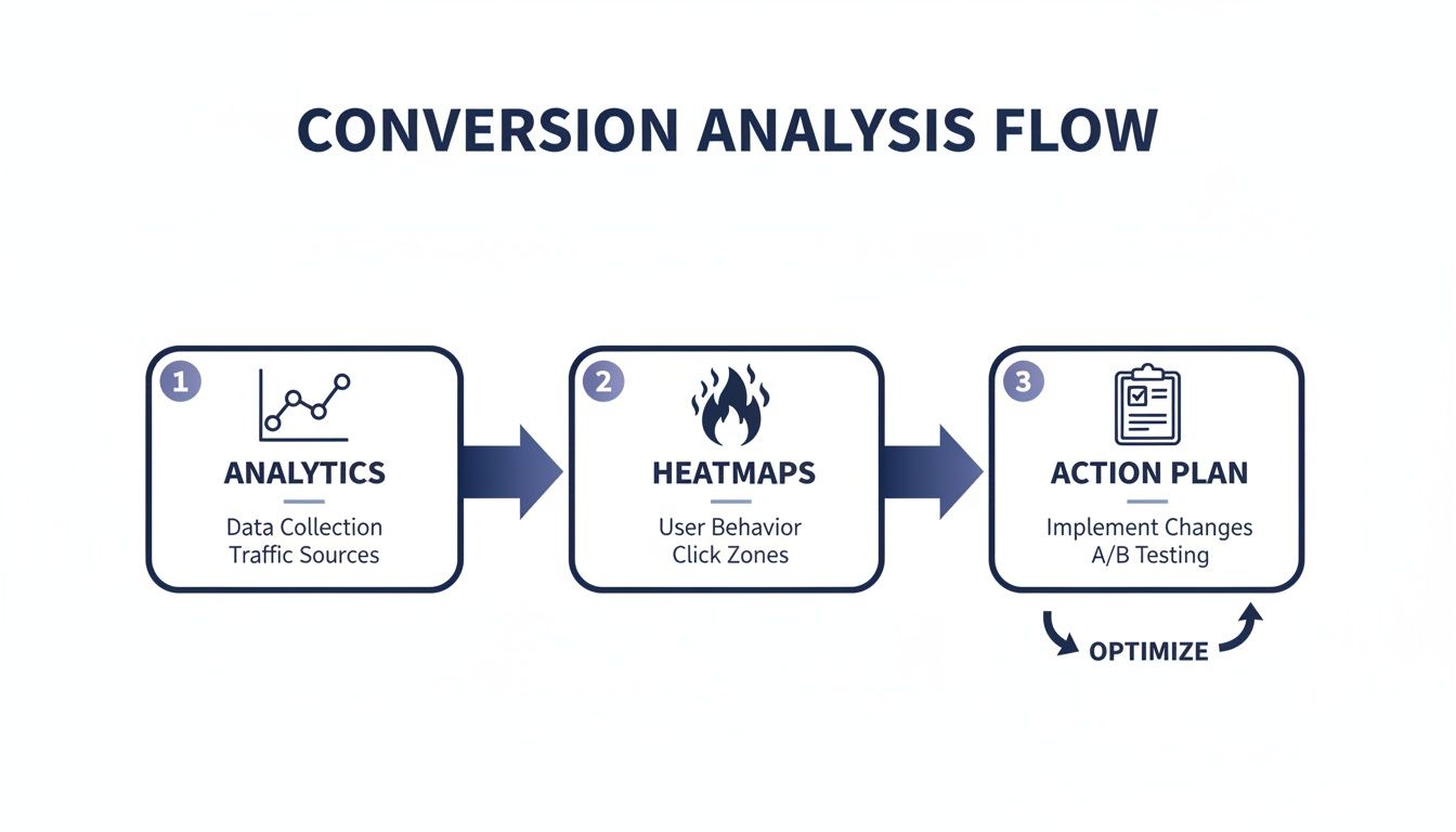
Before you can start fixing things, you have to play detective. Trying to optimize your store without knowing where shoppers are dropping off is like driving without a map. You can make a bunch of changes, but you’ll have no idea if you’re actually getting closer to your goal. The mission is to find the exact moments of friction that make a potential customer give up and leave.
This whole process kicks off with the hard numbers. Your Shopify Reports and Google Analytics are the first places you should be living. Dive straight into your sales funnel visualization to see where the biggest leaks are. Are people bailing from your product pages? Do you see a massive drop-off between someone adding an item to their cart and actually starting the checkout? The numbers will tell you what is happening.
From Data to Diagnosis
But the numbers only give you half the picture. To understand why people are leaving, you need to see your store through their eyes. This is where qualitative tools become your best friends:
Heatmaps: These tools are gold. They show you exactly where users are clicking, moving their mouse, and scrolling. A heatmap might reveal that almost no one is clicking your main call-to-action button, or worse, they're furiously clicking on something that isn't even a link.
Session Recordings: Watching anonymized recordings of real user sessions is like looking over their shoulders. You can see their mouse movements, where they get stuck, and where they hesitate. This adds invaluable context to what your analytics are telling you.
The key is to translate all this raw data into a clear, prioritized action plan. Don't try to fix everything at once. Find the one or two friction points that are costing you the most money, whether it’s a confusing product page or a clunky checkout flow. To get a better handle on the foundational elements and grab some actionable tips, you can learn how to improve your ecommerce conversion rates and start driving real growth.
This simple workflow is incredibly powerful: start with your analytics, layer on the "why" with insights from tools like heatmaps, and then build a focused plan of attack.
This process almost always points to the final, most critical stages of the customer journey: the cart and checkout.
Understanding the Financial Impact
Even tiny improvements here can have a massive impact on your bottom line. The average e-commerce conversion rate worldwide hovers between a modest 2% and 3%. The top-tier Shopify merchants often push past 3%.
Let's put that into perspective. For a store with 100,000 monthly visitors, lifting your conversion rate from 2% to just 3% means an extra 1,000 orders every single month.
And when you consider that typical cart abandonment rates sit around a painful 70–71%, it's obvious where the biggest opportunity is hiding. The cart and checkout are where the money is won or lost. This is why focusing on smart rewards—like free gifts or shipping thresholds that boost AOV—is so much more powerful than just slapping on another hefty discount. You enhance the customer experience and improve lifetime value at the same time.
Building Instant Trust and Blazing Speed
First impressions in ecommerce are everything.
Before a shopper even looks at your product descriptions, they’re making a snap judgment about your store. This happens in a fraction of a second, and it boils down to two simple things: speed and trust. A slow-loading page or a site that feels even a little unprofessional will send a potential customer bouncing right back to Google.
Mastering these two elements isn't just a "nice-to-have"—it's the foundation of a high-converting store.
Think of it this way: your website's performance is the digital version of a clean, well-lit storefront. If it’s slow, messy, or feels unsafe, people won't even step inside to see what you're selling. And every single second counts. A mere one-second delay in page load can crater your conversions, especially on mobile, where most of your traffic is probably coming from.

Optimize for Blazing Fast Performance
To keep shoppers from hitting the back button, your Shopify store needs to feel snappy and responsive. Slow speed is a notorious conversion killer, but the good news is you can make a real difference with a few targeted fixes.
Here’s a practical checklist to get your site speed up to par:
Compress Your Images. Huge, high-res product photos are a must, but they're also the #1 cause of slow pages. Use a tool like TinyPNG or the optimizer built into Shopify to slash file sizes without wrecking image quality.
Pick a Fast Theme. Not all Shopify themes are created equal. When you're choosing or updating your theme, look for ones that are specifically built for performance. Lightweight themes with regular developer updates are your best bet.
Use Lazy Loading. This is a simple but powerful trick. It tells the browser to only load images as the shopper scrolls down the page, instead of loading every single one at once. This dramatically improves how fast the page feels when it first appears.
Cut the App Bloat. Apps add great features, but too many can bog down your site. Do a regular audit of your installed apps and be ruthless. If an app isn't absolutely essential or you're not using it anymore, get rid of it.
A fast site does more than just stop people from leaving. It telegraphs professionalism and reliability. When a page loads instantly, it tells the customer your brand is efficient and respects their time—a crucial first step in earning their trust.
Earning Credibility with Unmistakable Trust Signals
Once your site is fast, you have to prove it's trustworthy. Shoppers are smarter and more cautious than ever, constantly looking for signs that a business is legitimate and that their payment info is safe. Building this credibility gives them the confidence they need to actually click "Add to Cart."
The key is to make this information impossible to miss. Don't make your customers dig around for the details that will put their minds at ease.
Key Trust-Building Elements for Your Store
Sprinkling these signals throughout your store can seriously boost your conversion rate by soothing customer anxiety at critical moments.
Visible Customer Reviews. Social proof is incredibly powerful. Get authentic product reviews and ratings right on your product pages where people can see them. It shows that real people have bought from you and were happy they did.
Clear Policies. Make your shipping and return policies ridiculously easy to find and understand. Link to them from your footer, of course, but also consider pulling out the key points (e.g., "Free Returns within 30 Days") and placing them near the "Add to Cart" button.
Secure Payment Badges. In your footer and on the checkout page, display the logos of trusted payment providers like Visa, Mastercard, PayPal, and Shop Pay. These familiar symbols are a visual shortcut for security.
An Authentic 'About Us' Page. Tell your story. A real 'About Us' page with genuine photos of your team and a clear mission helps humanize your brand. It makes you feel more relatable and trustworthy than a faceless, corporate entity.
Turning Your Cart Into a Conversion Engine
Your shopping cart should be your best salesperson. Period.
It’s the one place where a customer’s intent is at its absolute peak. But too many Shopify merchants treat it like a static holding pen—a final, boring step before checkout. This is a massive missed opportunity. The moment a customer adds an item, it's your job to guide that momentum forward, not bring it to a screeching halt.
Instead of seeing the cart as an endpoint, think of it as an interactive experience. It’s time to move beyond the default Shopify setup and build a powerful tool that actively encourages customers to spend more and hit "complete purchase" with zero hesitation.
From Static Page to Dynamic Slide Cart
The standard Shopify cart page is a conversion killer. It rips customers away from the product they were just looking at, forcing them to a totally new page and breaking their shopping flow. That single interruption is a huge source of friction.
A much smarter approach is a branded, slide-out cart that appears without navigating away.
This modern cart experience, like the one built into Monster Cart, keeps the shopper right in the moment. They can add an item, see their cart update instantly in a sleek drawer, and just keep browsing. It feels faster, more professional, and keeps their focus exactly where you want it.
A slide-out cart isn't just a design choice; it’s a strategic decision. By keeping the customer engaged on the product or collection page, you reduce the chances they'll second-guess their purchase or get distracted before they even begin the checkout process.
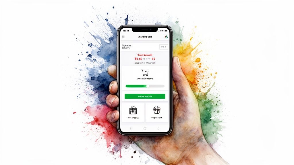
Gamify the Shopping Experience with Tiered Rewards
The real power of a modern cart is baking rewards directly into the shopping flow. This is where you can seriously boost your Average Order Value (AOV) without resorting to those margin-killing, site-wide discounts. The key is to create tiered incentives that turn shopping into a bit of a game.
Imagine a progress bar at the top of the cart that visually shows a customer how close they are to unlocking a reward. As they add items, they see the bar fill up. That simple visual cue is incredibly motivating.
Here’s how you can structure these incentives to get people to happily spend more:
Free Shipping Threshold: It's a classic for a reason. Clear messaging like, "You're only $12 away from free shipping!" is one of the most powerful motivators in ecommerce.
Spend-to-Unlock Discounts: Instead of a generic coupon, create a "Buy More, Save More" structure. Think: Spend $75, get 10% off; spend $100, get 15% off. The cart should automatically apply the better discount as their total grows.
Free Gift Tiers: This is often more compelling—and profitable—than a discount. Offer a desirable gift when a cart hits a certain value, like "Spend $100 and get our best-selling travel-size moisturizer for free!"
This approach is fundamentally about building customer lifetime value (LTV). By rewarding them for spending more, you’re creating a positive feedback loop that encourages loyalty and repeat business, all while protecting your profit margins. A tool like Monster Cart makes implementing this dynamic, tiered reward system incredibly simple.
Increase AOV with Strategic In-Cart Upsells
Once you have an engaged shopper in a dynamic cart, you can present relevant upsells that feel helpful, not pushy.
Annoying pop-ups that interrupt the experience will torpedo your conversion rate. Instead, upsells should be integrated directly and contextually right inside the cart drawer. It's a subtle but powerful shift from disruption to suggestion.
We've found that a simple comparison highlights just how much better this modern approach is for both the customer and your bottom line.
From Annoying Pop-Ups to Engaging In-Cart Rewards
Feature | Traditional Method (Pop-Ups) | Modern Method (Monster Cart) |
|---|---|---|
User Experience | Disruptive. Interrupts the shopping flow and often feels aggressive. | Seamless. Appears within a slide-out cart, keeping the user in context. |
Timing | Often appears at the wrong time, causing frustration and abandonment. | Presented at the moment of highest intent, right after an item is added. |
Relevance | Frequently generic and not tailored to the items in the cart. | Highly contextual, suggesting items that logically pair with the purchase. |
Conversion Impact | Can decrease conversions by annoying the user and causing them to leave. | Increases AOV by making relevant, helpful suggestions feel like a service. |
By moving these offers into the cart, you're not just selling; you're guiding.
Smart in-cart upsells can include:
Frequently Bought Together: Use your data to suggest logical product pairings. If a customer adds a shampoo, the cart can suggest the matching conditioner right below it. For merchants looking to fine-tune this strategy, our guide on Frequently Bought Together bundles provides a deeper playbook.
One-Click Add-Ons: Offer low-cost, high-value items that are easy "yes" decisions. Think shipping protection, gift wrapping, or priority processing.
Last-Chance Items: Feature a small, impulse-buy product directly in the cart, often labeled as a "customer favorite" or "add-on special."
By transforming your cart from a passive list into an active conversion engine, you meet customers where their intent is highest. Tools like Monster Cart give you the framework to build these engaging, reward-based experiences that not only boost AOV but also make the entire path to checkout faster and far more compelling.
Crafting Persuasive Pricing and Offers
How you frame your prices can be more powerful than the numbers themselves. Smart pricing isn't about deep discounts; it's about psychology. It’s about presenting your offers in a way that screams value and gets shoppers to buy without a second thought.
When you nail this, you make your customer feel like they’re getting an incredible deal. That feeling is one of the fastest ways to improve your ecommerce conversion rate. This means you stop thinking about slashing prices and start building a value proposition that’s too good to ignore.
Go Beyond Basic Discounts
Hefty, site-wide discounts are a blunt instrument. They attract bargain hunters who will leave as soon as the sale ends, and over time, they can cheapen your brand. A much smarter, more sustainable approach is to offer rewards that add value instead of just subtracting cost.
This is how you protect your profit margins while making customers feel genuinely appreciated. The goal isn't just to make a sale; it's to increase both Average Order Value (AOV) and Customer Lifetime Value (LTV).
So, what actually motivates your ideal customer? Is it convenience? Exclusivity? Or just getting a little something extra?
Free Shipping Thresholds: This is table stakes for most online shoppers today. A clear, dynamic message like, "You're only $11 away from free shipping!" is one of the most effective ways to get someone to add one more item to their cart.
Free Gift with Purchase: Offering a cool, desirable product as a gift can feel way more exciting than a small percentage off. It also lets you introduce customers to other products in your catalog.
Tiered Rewards: This is where things get fun. Create a "spend more, get more" ladder of incentives. For instance, spend $75 to unlock free shipping, but spend $100 and you also get a free gift. This gamifies the shopping experience and gives people a clear goal to shoot for.
These kinds of rewards can be built directly into a modern slide cart, like the one from Monster Cart. As shoppers add items, they see a progress bar fill up, visually nudging them toward the next reward. The cart stops being a boring list and becomes an interactive tool that drives up AOV all on its own.
The Psychology of Smart Pricing
Little tweaks in how you display your prices can have an outsized impact on whether someone decides to buy. These psychological tactics are dead simple to implement and can give your conversion rate a real lift.
One of the oldest tricks in the book is charm pricing, and it still works. This is when you end your prices in ".99" instead of a round number (like $29.99 vs. $30.00). Our brains are wired to anchor on that first digit, making the price feel significantly lower than it is.
Another killer strategy is creating irresistible product bundles. When you group related items together at a slightly discounted price, you not only increase the perceived value but also make the decision easier for the customer. For a masterclass in this tactic, check out these compelling examples of price bundling strategies used by top-tier brands.
By focusing on value-added rewards and psychological pricing, you create a win-win. Customers feel like they're getting a fantastic deal, and you protect your margins while encouraging bigger orders and building loyalty.
Position Upsells as Helpful Add-Ons
The last piece of the puzzle is the upsell. Done poorly, an upsell is an annoying, disruptive pop-up. But when you position it as a helpful, relevant suggestion, it actually improves the shopping experience.
The key is context and timing. Don't throw a random pop-up in their face. Instead, present upsells directly within the cart drawer right after a customer adds an item. It feels like a natural, helpful part of the process.
Here are a few ways to frame upsells that work:
The Complete Set: "Customers who bought this shampoo also loved the matching conditioner."
The Upgrade: "For just $10 more, get the deluxe version with a travel case."
The Protection Plan: "Add shipping protection for just $1.99 for peace of mind."
By crafting offers that prioritize value over discounts and positioning upsells as helpful guidance, you build a pricing strategy that boosts conversions today and nurtures customer relationships for tomorrow.
Designing a Frictionless Checkout Experience
This is it—the final step in your customer's journey. It's where all your hard work either pays off or falls apart. You've guided a shopper from a casual browse to a full cart, building trust along the way. But the checkout is the last hurdle, and any friction here can undo everything in an instant.
A confusing form, a surprise shipping cost, or a page that takes too long to load is all it takes to lose the sale. Your goal is to make buying from you so fast, simple, and secure that customers complete their purchase without a moment of hesitation. A streamlined checkout isn't a luxury; it’s a necessity.
Simplify and Secure the Final Steps
The best checkout experiences are practically invisible. They just get out of the way and let the customer pay. It’s all about removing needless steps and building confidence right when it matters most.
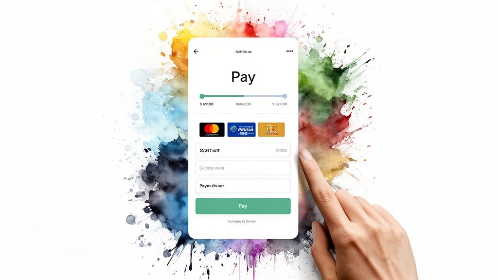
Enable Guest Checkout: Forcing someone to create an account is one of the biggest conversion killers out there. Always, always offer a guest checkout option. You can invite them to create an account on the "thank you" page after the sale is complete, when they're feeling good about their purchase.
Offer One-Click Payments: This is non-negotiable. Integrate accelerated payment options like Shop Pay, PayPal, and Apple Pay. They let customers check out in seconds by using saved information, completely bypassing the tedious process of typing in their address and credit card details.
Simplify Your Forms: Take a hard look at every single field in your checkout form. Do you really need their phone number? Is the "Company" field mandatory? Ask for the bare minimum needed to process and ship the order. Every extra field is another reason for someone to give up.
A great checkout is built on two things: trust and speed. When you ask for less information and offer familiar, secure payment options, you lower the perceived risk and mental effort for the customer. That makes them far more likely to click "buy now."
Master the Mobile Checkout Experience
Let's be real—most of your traffic is coming from mobile devices. But this is also where your abandonment rates are the highest. The data tells a clear story: while mobile accounts for 70–73% of ecommerce sessions globally, mobile conversion rates hover around a dismal 1.8–2.9%. Compare that to desktop, which converts at 3.9–4.8%.
Cart abandonment is especially brutal on phones. The overall rate is a painful 71.3%, but it jumps to an eye-watering ≈77.2% on mobile devices. This means mobile shoppers are significantly more likely to bail after adding products to their cart. You can see more of these ecommerce benchmarks and conversion rates on SpeedCommerce.com.
Small screens and thumb-typing require a totally different design mindset. A few small tweaks can make a massive difference.
Use Large, Tappable Buttons: Make sure every button and form field is big enough to be easily tapped with a thumb. Nothing is more frustrating than trying to hit a tiny "Next" button on a phone screen.
Add a Progress Bar: A simple visual bar showing the checkout steps (e.g., Shipping > Payment > Review) works wonders. It reduces anxiety by showing customers exactly where they are in the process and how much is left. This one change can have a huge impact on completion rates.
Keep It All on One Page (If Possible): While multi-step checkouts can be effective on desktop, a single-page checkout often feels much faster and less intimidating on a mobile device. It cuts down on clicks and page loads, which is exactly what you want.
Ultimately, a frictionless checkout anticipates what your customer needs and removes roadblocks before they even notice them. If you want to dive even deeper into proactive strategies, our guide on how to reduce cart abandonment is packed with more tactics you can implement today.
Your Questions on Improving Conversion Rate, Answered
Alright, we’ve covered a ton of ground—diagnosing funnel leaks, building trust, and fine-tuning your cart and checkout. Now, let’s get right to it and tackle some of the most common questions I hear from Shopify merchants every day.
What Is a Good Ecommerce Conversion Rate to Aim For?
Everyone wants to know the magic number, but the honest answer is: it depends. You’ll see stats quoting a global average between 2-3%, and for Shopify stores specifically, a baseline of 1.4% to 2.5% is pretty typical.
But fixating on a universal benchmark is a trap. A "good" rate for a store selling $50 t-shirts is going to be wildly different from one selling $2,000 furniture.
The only number that matters is your own. Your real goal should be to consistently beat your own baseline. Aim for a 10-20% lift from where you are right now—that's a fantastic, achievable target. The stores that consistently push past 3% aren't just lucky; they are relentless about optimizing the user experience, especially in the cart and checkout, where buying intent is at its peak.
How Can I Increase My Average Order Value Without Discounts?
This is a huge one. The key is to completely shift your mindset from slashing prices to adding value. You have to stop training your customers to wait for a sale and start rewarding them for spending more.
The most powerful way to do this is with a tiered rewards system built directly into the cart. It gamifies the shopping experience and gives customers a clear, compelling reason to add just one more item.
Think about a flow like this:
Tier 1: "You're $15 away from free shipping!"
Tier 2: "Spend $100 to unlock a free gift!"
Tier 3: "Spend $150 and get 15% off your entire order."
Focusing on rewards over hefty discounts is how you build customer lifetime value (LTV). It protects your profit margins and creates a positive, memorable experience that encourages people to come back, shifting the focus from a one-time transaction to a long-term relationship.
Smart upsells also play a massive role here. When they're presented seamlessly in a modern slide cart, like the one from Monster Cart, they feel like a helpful suggestion, not a pushy sales tactic. They boost AOV by showing customers relevant add-ons at the exact moment they're ready to buy.
What Is the Highest-Impact Area to Fix First?
Without a doubt, start where you’re losing the most money. That’s the journey between a customer clicking "Add to Cart" and actually completing the purchase.
Industry data consistently shows that over 70% of shopping carts are abandoned. That’s a staggering number. This makes your cart and checkout process the single highest-leverage area for immediate gains.
Sure, tweaking your homepage copy is important, but it won’t move the needle like plugging a leaky cart will. Rip out those annoying, disruptive pop-ups and replace them with a slick, in-cart rewards system. Be crystal clear about shipping costs upfront so there are no nasty surprises at the final step.
A well-designed slide cart that visually shows a shopper their progress toward unlocking rewards has a much more profound and immediate impact on your bottom line. It transforms a boring, functional step into a compelling experience that pulls customers across the finish line. For an even broader look at tactics, check out these 10 actionable strategies to increase your ecommerce conversion rate.
It's time to transform your Shopify cart from a simple holding page into your best salesperson. With Monster Cart, you can build a branded, high-converting slide-out cart with tiered rewards, in-cart upsells, and a frictionless path to checkout. Stop losing sales to clunky pop-ups and start boosting your AOV today. https://monsterapps.shop
Join 7000+ brands using our apps


