10 Ecommerce Checkout Best Practices to Boost AOV in 2026
Feb 4, 2026
|
Published

The checkout is the final, most critical step in the customer journey. Yet, for many merchants, it's also the leakiest part of the funnel, with an average cart abandonment rate hovering around 70%. The reasons are numerous and often frustratingly simple: unexpected costs, a complicated process, or a simple lack of trust. This isn't just lost revenue; it's a missed opportunity to build lasting customer relationships and increase lifetime value.
Fixing these issues is about more than just recovering a sale. A truly optimized checkout experience can significantly boost your Average Order Value (AOV) without resorting to margin-killing discounts. By implementing strategic ecommerce checkout best practices, you can guide customers smoothly from interest to purchase while encouraging them to add more to their cart. This guide provides 10 actionable strategies designed to plug those leaks and transform your checkout into a powerful revenue engine.
We'll focus on creating a seamless, trustworthy, and motivating experience through value-driven incentives like free gifts, shipping thresholds, and progressive rewards. You'll learn how to implement everything from a one-page checkout and guest options to mobile-first design and smart in-cart upsells. To truly master the customer journey and prevent revenue loss at this final stage, consider collaborating with a specialized UI/UX design consultant who can pinpoint precise friction points. Let’s turn your checkout from a conversion killer into your most valuable asset.
1. One-Page/Single-Step Checkout
One of the most effective ecommerce checkout best practices is consolidating the entire process onto a single page. Instead of forcing customers through multiple steps-shipping, then billing, then payment-a one-page checkout presents all required fields in a single, streamlined view. This reduces clicks, minimizes perceived effort, and significantly cuts down on the friction that leads to cart abandonment.
By keeping everything on one screen, you provide a clear, linear path to purchase. Customers can see the entire journey at a glance, which reduces cognitive load and anxiety. This transparency allows them to quickly review their order, see applied rewards or shipping thresholds, and enter payment details without navigating away from the core conversion action.

Why It Works & How to Implement
A single-page checkout creates a sense of speed and simplicity, making the final step feel less like a chore. Research from the Baymard Institute consistently shows that a complicated or long checkout process is a top reason for abandonment. By simplifying it, you directly address a major conversion blocker.
Consider how this approach pairs with your offer strategy. When customers can see their entire order, including shipping costs and any in-cart rewards like a free gift, it reinforces the value of their purchase. This is where tools like Monster Cart become powerful; a single-page view ensures customers see the final, rewarding offer right before they pay, encouraging them to complete the purchase and boosting AOV by building long-term value instead of relying on steep discounts.
Actionable Implementation Tips:
Smart Form Fields: Use auto-fill and auto-detect features for addresses and credit card types to minimize typing.
Prioritize Essential Fields: Place required fields like email and shipping address at the top. Clearly label optional fields.
Real-Time Validation: Provide instant feedback on form fields to correct errors immediately, preventing frustrating submission failures.
Mobile-First Design: Ensure the single page is responsive and easy to navigate on a small screen, with large tap targets and a logical vertical flow.
2. Progressive Disclosure with Conditional Form Fields
Another crucial ecommerce checkout best practice is to only show customers the form fields they actually need. Progressive disclosure with conditional fields dynamically reveals or hides parts of your checkout based on previous selections. This intelligent approach prevents customers from feeling overwhelmed by a long, intimidating form, significantly reducing cognitive load.
Instead of displaying every possible field, you present a clean, relevant interface that adapts in real-time. For example, the shipping address section can remain hidden if a customer's cart contains only digital products. This declutters the page, streamlines the path to purchase, and makes the entire process feel faster and more personalized.
Why It Works & How to Implement
A smart, adaptive form feels more intuitive and less like a chore. By removing irrelevant steps, you eliminate potential points of friction and confusion that lead to cart abandonment. This creates a smoother, more logical flow that guides the user toward completion without unnecessary distractions or effort.
This method also enhances your offer strategy. Imagine a customer has a specific product in their cart that qualifies them for a unique free gift. With conditional logic, you can display a tailored message or a special field related to that reward. Tools like Monster Cart excel here by showing only the relevant reward tiers or gift options based on what’s in the cart, making the incentive feel exclusive and highly relevant right at the point of conversion. This boosts AOV through strategic rewards, fostering better lifetime value rather than just relying on discounts.
Actionable Implementation Tips:
Logical Grouping: Group related fields together and reveal them based on a single trigger, such as hiding all shipping fields if "Digital Product" is selected.
Smooth Transitions: Use subtle animations or transitions when fields appear or disappear to create a fluid user experience rather than an abrupt change.
Clear Triggers: Ensure the action that triggers a new field is obvious. For instance, a checkbox labeled "This is a gift" could reveal fields for a gift message.
Thorough Testing: Test every conditional path to ensure all combinations work flawlessly and don't create dead ends or confusing loops for the customer.
3. Guest Checkout as Primary Option
One of the most significant barriers to conversion is forced account creation. A key ecommerce checkout best practice is to offer a guest checkout option as the primary, most prominent path to purchase. Instead of demanding that customers register an account upfront, you allow them to complete their order with minimal friction, collecting only the essential information needed for fulfillment.
This approach directly addresses a major cause of cart abandonment: user frustration. Forcing registration adds extra steps, requires creating and remembering another password, and can feel like an unnecessary commitment for a first-time buyer. By making guest checkout the default, you signal to customers that you value their time and convenience, creating a smoother, faster path to payment.
Why It Works & How to Implement
Guest checkout works because it lowers the barrier to entry and caters to the modern shopper's desire for speed. According to the Baymard Institute, 24% of shoppers abandon carts because the site wanted them to create an account. Removing this single requirement can recover a significant portion of potentially lost sales and improve the overall customer experience.
You can still encourage account creation strategically without interrupting the sale. The best time to ask is after the purchase is complete. At this point, the customer has already committed and sees the value in your products. You can then offer a simple, one-click option to create an account using the information they’ve already provided, perhaps incentivized with loyalty points or exclusive access to future offers, which helps build that crucial customer lifetime value.
Actionable Implementation Tips:
Make it Default: Position the "Checkout as Guest" button as the primary call-to-action, making it larger or more colorful than the "Sign In" option.
Offer Post-Purchase Signup: On the order confirmation page, invite customers to save their information for next time by creating an account with a single click.
Incentivize Registration: Provide a tangible benefit for creating an account post-purchase, such as 100 loyalty points, a small credit, or a free gift on their next order.
Capture Emails Early: Use an email field at the very beginning of the checkout process. This allows you to follow up with abandoned cart emails and build your marketing list, even if they don't finish the purchase.
4. Trust Signals and Security Reassurance
A critical ecommerce checkout best practice is to visibly reassure customers that their personal and payment information is safe. Trust signals are visual cues like security badges, SSL certificates, and money-back guarantees that reduce purchase anxiety at the most critical moment. When a customer is about to enter their credit card details, any hesitation can lead to an abandoned cart.
Displaying these trust indicators directly within the checkout flow serves as a final, crucial confirmation that your store is legitimate and secure. This builds confidence, making customers more comfortable completing their transaction. It shifts their focus from potential risk to the value of their purchase, which is essential for a smooth conversion.
Why It Works & How to Implement
Asking for payment information is the highest-friction point in the customer journey. Trust signals work by preemptively answering the subconscious question, "Is this website safe?" According to Baymard Institute, 19% of shoppers abandon carts because they don't trust the site with their credit card information. By proactively displaying security reassurances, you directly address this major conversion killer.
This is also an opportunity to reinforce your brand's unique value proposition. Beyond generic security badges, highlighting your own guarantees (like a 365-day free returns policy) builds a different kind of trust. When a tool like Monster Cart displays these signals and your brand's unique guarantees within the cart drawer itself, it builds confidence early on. Customers see that your brand stands behind its products and security even before they reach the final checkout page, encouraging them to add more items to unlock rewards and increasing their lifetime value.
Actionable Implementation Tips:
Strategic Placement: Place security badges (e.g., PCI DSS, Norton, McAfee) directly beside or below the payment input fields where customer anxiety is highest.
Highlight Brand Guarantees: Display your unique policies, like a 30-day satisfaction guarantee or free returns, prominently above the "Complete Order" button.
Use Official Graphics: Always use high-quality, official badge graphics provided by the security companies, not blurry screenshots, to maintain credibility.
Reinforce in the Cart: Use your cart drawer to showcase trust signals alongside in-cart offers, reminding customers of your secure shopping experience as they build their order.
Keep Policies Accessible: Ensure links to your full privacy policy and terms of service are visible but unobtrusive in the checkout footer.
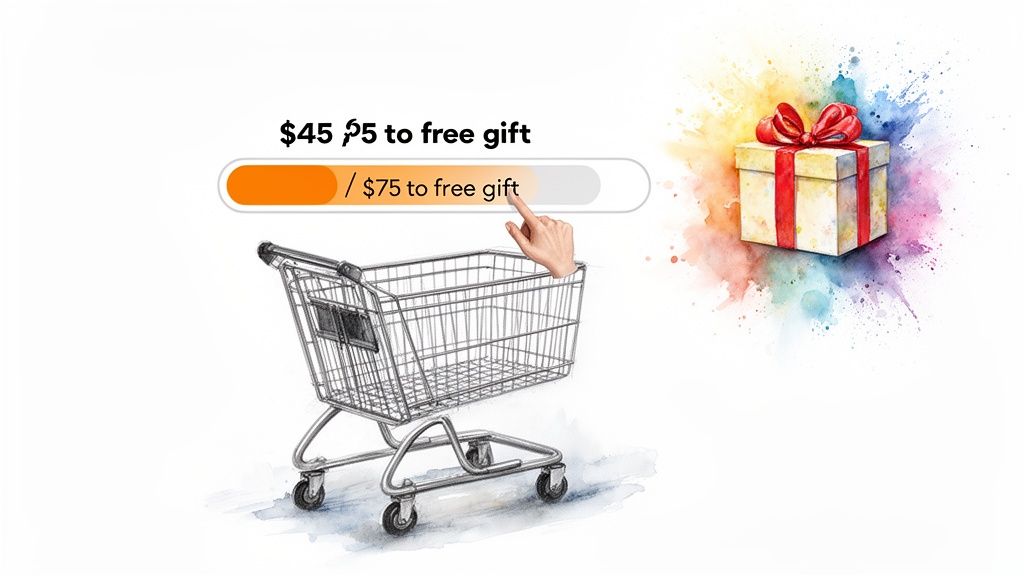
5. Cart Abandonment Recovery with In-Cart Incentives
Instead of waiting for a customer to leave before sending a recovery email, one of the most proactive ecommerce checkout best practices is to prevent abandonment before it happens. By implementing incentives directly within the cart and checkout experience, you can turn hesitation into motivation. This strategy uses spend-to-unlock rewards like free shipping or a free gift to create a compelling reason for customers to complete their purchase and even increase their order value.
This approach gamifies the final steps of the shopping journey. A customer who is on the fence about a purchase might be swayed by seeing they are only a few dollars away from a valuable reward. It transforms the checkout from a simple transaction into an engaging, rewarding experience, directly combating the friction that often leads to abandoned carts.
Why It Works & How to Implement
In-cart incentives work by tapping into powerful psychological triggers like urgency and the fear of missing out (FOMO). When customers see a progress bar showing how close they are to a reward, it creates a clear goal and encourages them to add another item to their cart to reach it. This not only secures the sale but also boosts your Average Order Value (AOV) without resorting to steep, brand-devaluing discounts.
This strategy is about enhancing value, not just cutting prices. Merchants master this by setting free shipping or reward thresholds just above their AOV, creating a natural upsell opportunity. Tools like Monster Cart are purpose-built for this, providing real-time visual progress bars that update as customers add items, making the incentive impossible to ignore. This method builds excitement right at the point of conversion and is a key technique if you want to learn how to reduce cart abandonment effectively.
Actionable Implementation Tips:
Set Strategic Thresholds: Analyze your AOV and set reward milestones about 25-30% higher to create an achievable "stretch goal" for customers.
Visualize Progress: Use dynamic progress bars or text that updates in real-time (e.g., "You're only $10 away from a free gift!").
A/B Test Your Offers: Experiment with different rewards—free shipping, a percentage discount, or a free gift—to see what resonates most with your audience.
Make the Reward Valuable: Ensure the incentive feels significant enough to justify the extra spend, reinforcing customer lifetime value over a one-time sale.
6. Frequently Bought Together (FBT) and Smart Product Recommendations
One of the most powerful ecommerce checkout best practices for increasing average order value (AOV) without relying on discounts is presenting "Frequently Bought Together" (FBT) offers. This strategy displays complementary products directly in the cart or checkout, making it easy for customers to add relevant items with a single click. Instead of a generic upsell, this feels like a helpful suggestion, similar to a knowledgeable sales associate guiding a purchase.
By showcasing items that genuinely enhance the primary product, you improve the customer experience while simultaneously boosting revenue. For example, a customer buying a camera might be shown a compatible memory card and a case. This approach is contextual, valuable, and far less intrusive than a pop-up, making it a seamless part of the buying journey.
Why It Works & How to Implement
Smart product recommendations work because they tap into the customer's current buying intent. They are already committed to a purchase, and a relevant suggestion removes the need for them to search for accessories or related items later. This convenience often translates directly into a higher cart value and increased customer lifetime value.
This is where a tool like Monster Cart excels. Its native FBT feature allows you to build compelling, non-intrusive offers that appear right in the cart drawer. Instead of pushing a simple upsell, you can create value-driven bundles or "complete the look" suggestions that feel like a personalized service. This method encourages larger purchases by enhancing the core order rather than just asking customers to spend more. You can learn more about how to set up effective FBT strategies in this in-depth guide.
Actionable Implementation Tips:
Focus on Complements: Recommend products that genuinely add value to the items already in the cart, like a phone case for a new phone.
Limit the Choices: Display 2-3 highly relevant recommendations to avoid overwhelming the customer with choice paralysis.
Use Social Proof: Add a simple message like "Often bought with your items" to build trust and validate the suggestion.
Ensure Visual Clarity: Include clear product images, prices, and a one-click "Add" button to make the process frictionless.
7. One-Click Add-Ons and Impulse Purchase Options
One of the smartest ecommerce checkout best practices is to offer low-friction, high-value add-ons directly in the cart or checkout. Instead of interrupting the customer with a pop-up, you can present options like shipping protection, extended warranties, or gift wrapping as simple one-click toggles. This allows customers to enhance their purchase with minimal effort, tapping into impulse buying behavior right before payment.
Presenting these options at the final stage capitalizes on the customer's high purchase intent. They are already committed to buying, and a small, relevant add-on feels like a valuable enhancement rather than a disruptive upsell. This strategy is a powerful way to increase Average Order Value (AOV) without resorting to steep discounts that can erode your margins and brand value over time.
Why It Works & How to Implement
One-click add-ons work because they offer clear, immediate value with almost zero friction. The customer doesn't have to leave the checkout, search for a new product, or navigate complex options. A simple toggle switch or checkbox, like those used by Amazon for protection plans or Etsy for shipping insurance, makes the decision effortless. This seamless integration boosts AOV and enhances the customer experience by providing useful services.
This tactic is particularly effective for merchants looking to build long-term value. By offering a useful add-on, you're not just increasing the current transaction value; you're providing a better overall service that can lead to higher customer satisfaction and loyalty. For instance, tools like Monster Cart can present these add-ons natively within the checkout flow, ensuring the customer sees the added value right as they are about to complete their purchase, reinforcing their decision. For a deeper dive into similar strategies, explore some of the best upsell apps for Shopify.
Actionable Implementation Tips:
Clearly State the Value: Don't just list the price. Briefly explain the benefit, such as "Worry-Free Shipping Protection" or "2-Year Extended Warranty."
Use Visual Cues: Employ icons or subtle visual elements to differentiate add-ons like gift wrapping from warranties, making them easy to scan.
Strategic Placement: Position these options just before the final payment button, where the customer is reviewing their order summary.
Test Default States: A/B test whether having an option pre-selected (like shipping protection) or off by default generates a better adoption rate without causing negative feedback.
Ensure Fulfillment Integration: Confirm your backend systems can seamlessly process and fulfill orders with these add-ons to avoid operational headaches.
8. Transparent Pricing and Hidden Cost Disclosure
One of the most damaging mistakes an ecommerce store can make is surprising a customer with unexpected costs at the final step. An essential ecommerce checkout best practice is to display all costs, including shipping, taxes, and any fees, as early as possible. Full transparency eliminates the "sticker shock" that causes shoppers to abandon their carts right before paying.
Presenting an itemized breakdown of the total cost builds immediate trust. When a customer sees exactly what they are paying for, from the product price to the shipping fee, it removes doubt and friction. This clarity reinforces their decision to purchase, making them feel confident and respected rather than deceived by hidden charges.
Why It Works & How to Implement
According to Baymard Institute, extra costs like shipping and taxes are the number one reason for cart abandonment during checkout. By revealing these costs upfront, you address the primary conversion killer head-on. Brands like Warby Parker and ASOS excel at this by showing clear, all-inclusive pricing or displaying shipping costs directly in the cart, long before the final payment screen.
This transparency also enhances the value of your offers. When a customer sees a free shipping reward or a discount applied in a clear cost summary, the value becomes tangible. Using a tool like Monster Cart allows you to display this itemized summary directly in the cart drawer, ensuring customers see the full, transparent cost and the value of their rewards from the very beginning, motivating them to complete the purchase and fostering long-term loyalty.
Actionable Implementation Tips:
Show Shipping Early: Use a shipping calculator on the cart page or display estimated shipping costs based on location as soon as it's known.
Real-Time Tax Calculation: Integrate your checkout to calculate and display taxes once a shipping address is entered, not just at the final review.
Use a Cost Breakdown: Clearly separate the subtotal, shipping, taxes, and any applied discounts in a simple, easy-to-read format.
Explain All Fees: If you have handling or service fees, label them clearly and provide a brief explanation for what they cover to avoid confusion.
9. Mobile-First and Progressive Web App (PWA) Optimization
With mobile commerce now dominating online sales, optimizing for smartphones isn't just an option; it's a necessity. One of the most critical ecommerce checkout best practices is adopting a mobile-first design philosophy. This means designing the checkout experience for the smallest screen first and then scaling it up for larger devices, rather than trying to shrink a desktop design. This approach inherently prioritizes speed, simplicity, and touch-friendly interactions.
Progressive Web Apps (PWAs) take this a step further by delivering an app-like experience directly through a mobile browser. PWAs are fast, reliable, and can work offline, removing significant friction without forcing customers to download an app from an app store. Brands like Alibaba and Trivago have used PWAs to dramatically increase mobile conversions and engagement by providing a seamless, high-performance checkout.
Why It Works & How to Implement
A slow or clunky mobile checkout is a primary cause of cart abandonment. A mobile-first approach directly addresses this by creating a lightweight, intuitive, and fast-loading process tailored to on-the-go shoppers. It ensures that every element, from form fields to buttons, is optimized for thumbs, not mouse clicks.
This mobile-centric view is also perfect for presenting clear, compelling offers. When a customer adds items to their cart on a phone, they need to see their rewards instantly. A mobile-optimized tool like Monster Cart ensures that in-cart offers, such as a free gift or a shipping threshold progress bar, are displayed clearly and responsively. This encourages customers to add more to their cart to unlock rewards, boosting AOV and lifetime value right from their phone.
Actionable Implementation Tips:
Large, Tappable Elements: Ensure all buttons, links, and form fields are large enough to be easily tapped without accidental clicks, with a minimum size of 48x48 pixels.
Optimize Form Inputs: Use smart keyboards that automatically show the numeric keypad for phone numbers or credit card fields. Reduce the number of required fields to the absolute minimum.
Aggressive Performance Tuning: Aggressively compress images and implement lazy loading to ensure the initial page loads almost instantly, even on slower mobile connections.
Incorporate Biometric Payments: Simplify the final step by integrating one-tap payment options like Apple Pay, Google Pay, and Shop Pay, which use Face ID or fingerprint authentication.
10. Personalization and Smart Cart Recommendations Based on Behavior
One of the most powerful ecommerce checkout best practices is leveraging customer data to deliver a personalized experience. Instead of a one-size-fits-all approach, you can use browsing history, past purchases, and even location to tailor recommendations, messaging, and in-cart offers. This transforms the checkout from a generic transaction into a relevant, helpful final step that speaks directly to the individual shopper.
By personalizing the checkout, you show customers you understand their needs and preferences. Displaying a relevant add-on product that complements what’s already in their cart, or reminding them of a reward they’re close to unlocking, makes the experience feel curated. This level of relevance not only increases the likelihood of conversion but also boosts customer loyalty and lifetime value.
Why It Works & How to Implement
Personalization works because it cuts through the noise. When customers see recommendations that genuinely align with their interests, like Amazon’s “Frequently Bought Together,” it feels less like an upsell and more like a helpful suggestion. This strategy directly increases Average Order Value (AOV) by encouraging customers to add more to their cart with value-added rewards rather than store-wide discounts.
This is where you can move beyond simple cross-sells. By integrating with customer data, an app like Monster Cart can present personalized reward tiers. For example, a returning VIP customer might see an exclusive free gift offer, while a new visitor sees a compelling free shipping threshold. This makes the incentive feel earned and special, encouraging them to complete the purchase and spend a little more to unlock their unique reward, boosting lifetime value.
Actionable Implementation Tips:
Segment Your Customers: Create distinct segments (e.g., new vs. returning, VIPs, interest in a specific category) to deliver targeted messaging and offers.
Use Behavioral Triggers: Base recommendations on real-time actions, such as items viewed, products added to the cart, or past purchase history.
A/B Test Your Strategies: Test different types of personalized recommendations, such as “You might also like” versus “Complete the look,” to see what resonates.
Be Transparent About Data: Reassure customers by including a clear privacy policy and explaining how you use their data to improve their shopping experience.
10-Point Ecommerce Checkout Best Practices Comparison
Approach | 🔄 Implementation Complexity | ⚡ Resource Requirements | 📊 Expected Outcomes | 💡 Ideal Use Cases | ⭐ Key Advantages |
|---|---|---|---|---|---|
One-Page / Single-Step Checkout | Medium — careful IA, validation & mobile design | Moderate dev + UX testing; performance tuning | High conversion uplift (~10–15%); faster completions | Repeat customers, mobile-first stores, firms prioritizing speed | Streamlined flow; lower abandonment; improved mobile UX |
Progressive Disclosure with Conditional Form Fields | High — complex conditional logic & broad testing | Higher backend logic, QA, and monitoring | Improved completion & data quality; ~15–20% reduction in abandonment | Catalogs with mixed product types (digital vs physical), complex shipping rules | Relevance-driven UX; reduced cognitive load |
Guest Checkout as Primary Option | Low — policy + tracking adjustments | Minimal dev; needs guest tracking & email capture | Significant lift (up to ~25% less abandonment) and faster purchases | New customers, first-time buyers, low-fidelity conversion goals | Low friction path; higher immediate conversions |
Trust Signals and Security Reassurance | Low — add badges, copy & verify compliance | Low design effort; legal/third‑party verification maintenance | Medium–High uplift (8–15%), especially for unfamiliar brands | New brands, high-ticket items, privacy-concerned audiences | Reduces anxiety; builds credibility at payment |
Cart Abandonment Recovery with In-Cart Incentives | Medium — UI + real-time business rules | Moderate–high: analytics, creative, dev for live updates | Very High recovery (25–35%) and AOV lift (15–30%) | Stores with margin flexibility and measurable AOV goals | Immediate cart recovery; transparent motivation to spend more |
Frequently Bought Together (FBT) & Smart Recommendations | Medium — recommendation engine & data integration | Moderate: catalog data, algorithms or tooling, UX | AOV increase ~10–25%; better cross-sell rates | Large catalogs, complementary-product sellers | Contextual upsells without heavy discounting |
One-Click Add‑Ons & Impulse Options | Low — UI toggles, fulfillment hooks | Low–moderate: product setup, checkout integration | AOV +5–15%; incremental high-margin revenue | Consumables, warranties, gift-wrap, express services | Low-friction, high-margin add-ons; simple conversion driver |
Transparent Pricing & Hidden Cost Disclosure | Medium — real-time shipping/tax integrations | Moderate: shipping/tax APIs and UI breakdowns | High reduction in cost-related abandonment (15–20%) | Cross-border sales, variable shipping/tax scenarios | Eliminates surprise fees; builds trust and satisfaction |
Mobile‑First & PWA Optimization | High — responsive design, PWA features & testing | High: front-end dev, performance engineering, QA | Very High mobile conversion gains (15–30%); lower abandonment | Mobile-dominant audiences, brands seeking app-like UX | Fast, touch-friendly checkout; improved retention & SEO |
Personalization & Smart Cart Recommendations | High — data pipelines, ML models, privacy controls | High: data engineering, ML tooling, compliance resources | Conversion & AOV lift ~10–20%; higher repeat rates | Loyalty programs, returning customers, rich behavior data | Highly relevant offers; stronger repeat purchase behavior |
Transform Your Cart Into a Conversion Powerhouse
You've explored the ten pillars of a high-converting checkout, from streamlining the user flow with a one-page design to building unshakable trust with security badges. Each practice we've discussed is a powerful tool in your ecommerce arsenal. However, the true magic happens when you stop seeing these as individual tweaks and start viewing them as interconnected components of a single, customer-obsessed journey. The goal is not just to process a transaction; it's to validate a customer's decision and make them feel great about their purchase.
Implementing these ecommerce checkout best practices is fundamentally an exercise in empathy. It’s about anticipating a user's anxieties, answering their unspoken questions, and removing every ounce of friction that stands between "I want this" and "It's on its way." A seamless checkout experience is a direct reflection of your brand's respect for its customers' time and trust.
Key Takeaways for Immediate Impact
The path from a standard checkout to a conversion powerhouse is paved with strategic, iterative improvements. Don't feel pressured to implement everything at once. Instead, focus on the areas that will deliver the most significant impact for your unique audience.
Prioritize Friction Reduction: The most common theme across all these best practices is the elimination of unnecessary steps and mental effort. Guest checkout, one-page designs, and mobile-first optimization are non-negotiable starting points.
Build Value, Not Just Discounts: The most sustainable way to increase your Average Order Value (AOV) is by adding value, not slashing prices. Shift your focus from "10% off" to "Spend $15 more for a free gift" or "Unlock free shipping." This approach protects your margins and trains customers to spend more to receive more, nurturing higher lifetime value.
Trust is Your Most Valuable Currency: From transparent pricing to prominent security seals and clear return policies, every element should reinforce that your store is a safe and reliable place to do business. This is especially crucial for winning over first-time buyers.
The Cart is Your Final Pitch: Treat your shopping cart not as a simple holding area, but as the final, most persuasive stage of your sales funnel. This is where smart upsells, one-click add-ons, and progress-based rewards can transform a standard purchase into a more valuable and engaging experience.
Your Actionable Next Steps
Mastering your checkout is an ongoing process of testing, learning, and refining. Begin by identifying the single biggest point of friction in your current process. Is it a clunky mobile interface? A surprise shipping fee at the last step?
Analyze Your Data: Dive into your analytics to pinpoint where users are dropping off in the funnel. This data is your roadmap for what to fix first.
Choose One Strategy: Select one of the ecommerce checkout best practices from this article to implement this week. A great starting point is adding a free gift threshold or enabling guest checkout.
Measure and Iterate: Launch your change as an A/B test. Monitor your conversion rate, AOV, and cart abandonment rate. Let the data tell you what's working, then move on to the next optimization.
Ultimately, a world-class checkout experience does more than just capture a sale. It leaves a lasting positive impression, turning one-time buyers into loyal advocates for your brand. By investing in a seamless, trustworthy, and value-driven checkout, you are investing directly in the long-term health and profitability of your business.
Ready to implement advanced in-cart rewards and upsells without complex custom code? Monster Cart transforms Shopify's standard cart into a dynamic rewards engine, allowing you to easily set up spend goals, free gift tiers, and one-click offers. Start turning your cart into a conversion machine today by exploring Monster Cart.
Join 7000+ brands using our apps


