How to Optimize Ecommerce Website Performance and Boost Sales
Feb 17, 2026
|
Published

If you want to seriously optimize your ecommerce site, you have to start with two things that matter more than anything else: lightning-fast site speed and a flawless mobile experience. These aren't just technical boxes to check off a list. They’re the foundation for every other conversion trick in the book, from your product page design all the way to your checkout flow.
Get these wrong, and even the most brilliant marketing campaign is dead on arrival.
Why Speed And Mobile Are Your Top Priorities
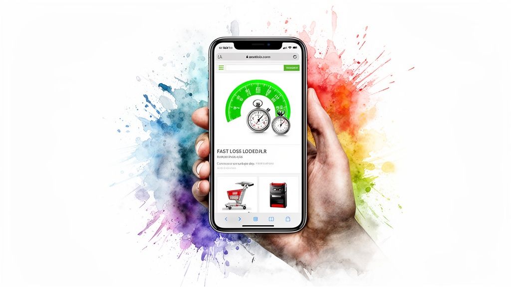
Let’s be real for a second. A slow, clunky website is actively losing you sales, every single minute of every day. The first impression a shopper has of your brand isn't your logo or your products—it's your loading time. That initial technical handshake sets the tone for their entire journey. If it’s slow and frustrating, especially on a phone, they’re going to assume your brand is, too.
This guide is your playbook. We're breaking down everything a Shopify store owner needs to know, from the basics of site speed and mobile UX to the more advanced tactics for boosting your Average Order Value (AOV). Think of this as the essential first step toward real, sustainable growth.
To give you a clearer picture of how these pieces fit together, let's look at the core optimization areas we'll be covering and the direct impact they have on your bottom line.
Core Optimization Pillars and Their Business Impact
This table outlines the key optimization areas in this guide and their direct impact on critical metrics like conversion rate and average order value (AOV).
Optimization Pillar | Primary Goal | Key Business Metric Impacted |
|---|---|---|
Site Speed & Mobile UX | Reduce friction and build trust from the first click. | Conversion Rate, Bounce Rate |
Product Page Optimization | Persuade shoppers with compelling visuals and information. | Conversion Rate, Add-to-Cart Rate |
Navigation & Search | Help customers find what they want, fast. | Conversion Rate, Time on Site |
Cart & Checkout Flow | Make buying effortless and intuitive. | Cart Abandonment Rate, Conversion Rate |
AOV Growth Tactics | Encourage customers to add more to their order. | Average Order Value (AOV), Profit Margin |
Analytics & A/B Testing | Make data-driven decisions to improve continuously. | All metrics (CRO, AOV, LTV) |
As you can see, each pillar is designed not just to improve your website, but to directly grow your business by improving key performance indicators.
The Real Cost Of A Slow Website
The damage a slow page does to your revenue is instant and brutal. Picture a customer landing on your Shopify store, ready to buy, but the page just spins and spins on their phone. They're gone. And they're probably not coming back.
This isn’t just a hunch; the data is painfully clear. A staggering 53% of mobile visitors will ditch a page if it takes longer than 3 seconds to load. Even worse, for every extra second of delay, conversion rates drop by an average of 4.42%.
Every single millisecond counts. A faster site doesn't just feel slicker—it directly translates into more sales and happier customers. This is ground zero for optimization.
Embracing A Mobile-First Reality
"Mobile-first" isn't just some trendy buzzword anymore; it's a core revenue strategy. The majority of your traffic and a huge chunk of your sales are happening on smartphones. Your mobile site is your main storefront.
Simply shrinking your desktop design to fit a smaller screen is a recipe for disaster. It leads to a frustrating mess of pinching, zooming, and accidentally tapping the wrong buttons.
A true mobile-first strategy means you design the shopping experience for the smallest screen first, then scale it up. This forces you to prioritize what's essential, making things like navigation, product images, and "Add to Cart" buttons clean and easy to use for someone shopping on the go.
You have to think about the user’s real-world context. They might be browsing with one hand while waiting in line, on a spotty Wi-Fi connection, or just in a hurry. Your site has to be simple, clean, and ridiculously fast. A smooth mobile experience builds trust and makes buying feel effortless—setting the stage for repeat business and higher lifetime value. For a deeper look, check out our guide on building an ecommerce growth strategy.
Ultimately, a solid technical foundation is the key to unlocking higher performance across the board. To truly move the needle, you have to improve your ecommerce conversion rate and boost sales with a holistic approach that starts here.
The Foundation For AOV and LTV Growth
At the end of the day, site speed and mobile usability aren't just about preventing people from leaving. They're about creating a positive, frictionless environment where customers feel comfortable sticking around and spending more money.
When you nail these fundamentals, you earn the right to ask for the next step—whether that's adding another item to their cart or hitting that final "complete purchase" button.
This is where things get exciting. A superior user experience sets the perfect stage for more advanced AOV-boosting tactics, like in-cart rewards that unlock a free gift or free shipping. These strategies are infinitely more effective when the site they're built on is fast and intuitive. This focus on adding value is how you build real, long-term customer relationships and increase lifetime value (LTV).
Turning Product Pages Into Conversion Engines
Once you’ve got a fast, mobile-friendly foundation, it’s time to focus on where the magic really happens: your product pages. Think of these pages as your digital salespeople, working around the clock. Their one and only job is to build enough trust and desire to convince a shopper to click "Add to Cart."
A generic product listing with a few dusty bullet points and a stock photo just isn't going to get it done. To actually drive sales, your pages need to be persuasive, answer questions before they’re even asked, and forge a real emotional connection with your customer.
Write Copy That Sells an Outcome
Here’s a secret: shoppers don't buy products; they buy solutions to their problems or a better version of themselves. Your product copy needs to stop focusing on dry specifications and start talking about benefits and experiences.
Instead of just listing "100% cotton," describe the feeling: "Made from incredibly soft, breathable cotton that feels gentle against your skin all day long." See the difference? That paints a picture and connects the feature (cotton) to a tangible benefit (comfort).
Get inside your customer's head. What questions are they asking? For a piece of cookware, they're probably wondering, "Is it a pain to clean?" or "Will this even work on my induction stove?" Answer those questions directly in your copy.
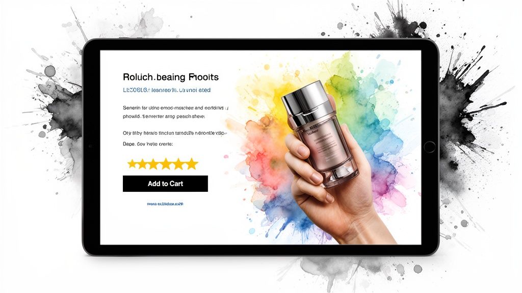
Leverage High-Quality Visuals and Video
In ecommerce, your visuals have to do all the heavy lifting. Since customers can't physically pick up the item, your images and videos are responsible for filling that sensory gap. High-quality visuals are completely non-negotiable for building trust.
Show Multiple Angles: Give them the full tour. Use photos that showcase the product from the front, back, side, and get in close for the details.
Provide Context of Use: A photo of a backpack on a hiker is infinitely more compelling than one floating on a stark white background. Show the product in its natural habitat.
Use Video Demonstrations: A short video can demonstrate a product's features, scale, and functionality in a way static images never could. This is especially powerful for complex or technical items.
The goal is to leave zero room for doubt. The more a customer can visualize themselves using your product, the more confident they'll be when they click "buy."
Build Trust with Social Proof
Let's be honest, shoppers trust other shoppers way more than they trust brands. That’s why social proof—like customer reviews and user-generated content (UGC)—is one of the most powerful tools in your entire conversion arsenal. It’s unbiased proof that your product actually delivers on its promises.
Placing customer reviews and ratings prominently "above the fold" can immediately disarm a visitor's skepticism. Integrating a gallery of customer photos (UGC) showing your product in the real world adds a layer of authenticity that even the best-branded photography can't replicate.
This social proof acts as a massive risk-reducer, assuring new customers that other people have bought and loved what you're selling. For a deeper dive into this, you can explore more strategies for Shopify conversion rate optimization.
Make the Purchase Decision Easy
The final elements of your product page should be all about removing friction and making that "Add to Cart" button impossible to resist. Clarity is everything.
Transparent Pricing: Don't be shy. Display the price clearly, and if you offer payment plans like Klarna or Afterpay, show them upfront.
Clear Shipping Information: Nobody likes surprises at checkout. Provide a shipping estimate or a link to your policy right on the product page. Unexpected shipping costs are the #1 reason for cart abandonment.
A Strong Call-to-Action (CTA): Your "Add to Cart" button needs to pop. Make it bold, visually distinct from other elements, and use action-oriented language.
By obsessing over these details, you create a seamless and reassuring experience. The shopper feels informed, confident, and ready to take the next step. This isn't just about boosting a single conversion; it's about setting the stage for a positive, trustworthy shopping journey that builds real customer lifetime value from day one.
Designing an Effortless Path to Purchase
A fast site with beautiful product pages is a great start, but it's all for nothing if customers get lost trying to find what they want. If a shopper has to click around aimlessly to find their item, frustration sets in fast. Before you know it, they've bounced to a competitor with a simpler layout.
The whole goal is to carve out a clear, intuitive path from the moment they land on your site to the second they hit "complete purchase." This means thinking critically about your site’s structure to cut down on clicks, kill confusion, and guide shoppers effortlessly toward a sale.
Crafting Intuitive Navigation and Menus
Your main navigation menu is the roadmap to your entire store. It needs to be so simple that a first-time visitor can instantly get the lay of the land and know exactly where to go next.
Avoid the temptation to cram every single category into one massive, overwhelming drop-down. That just creates visual clutter and decision paralysis.
Instead, group your products into logical, high-level categories. A clothing store, for example, might have top-level menus for "Men," "Women," and "Accessories." From there, sub-menus can break it down into "Tops," "Bottoms," and "Outerwear." This clean, hierarchical structure not only helps your users but is also fantastic for SEO, as it helps search engines understand the relationships between your pages.
Implementing Smart Product Filters and Sorting
Once a shopper lands on a category page, don't force them to scroll through hundreds of products. This is where smart filtering and sorting options become your most valuable conversion tools. They let customers instantly slice through a huge catalog to find the exact items that fit what they're looking for.
Think about the key details your customers actually care about:
Size and Color: These are non-negotiable for apparel and many other product types.
Price Range: A slider or predefined price brackets help budget-conscious shoppers stay on track.
Brand or Collection: Essential for stores carrying multiple product lines or third-party brands.
Ratings and Reviews: Letting users filter by the highest-rated products is a huge trust signal.
The key is to empower the shopper. By giving them control to refine their search, you transform a potentially overwhelming browsing experience into a quick and satisfying hunt. This is a critical step to optimize your ecommerce website for conversions.
The Power of an Intelligent On-Site Search
Your on-site search bar is more than just a box in the header—it’s a direct line to your most motivated buyers. Shoppers who use search have high purchase intent. They know what they want, and they're ready to buy it now. A clunky search function that returns "no results found" for simple queries is a dead end that sends valuable customers packing.
You need to invest in a search solution that offers features like:
Autocomplete: Suggests products as the user types.
Typo Tolerance: Understands and corrects common misspellings.
Image Previews: Shows a product thumbnail right in the search results.
A powerful search function acts like a knowledgeable salesperson, instantly connecting a ready-to-buy customer with the perfect product. This is especially crucial on mobile, where typing is a pain and patience is thin.
After all, with smartphones driving over 78% of retail website visits worldwide, a poor mobile navigation experience will cripple your sales. A staggering 92% of users prioritize sites that are easy to navigate on their phones. You can find more compelling ecommerce facts and statistics that back this up. By creating an effortless discovery process, you’re not just improving the user experience; you’re building a store that encourages shoppers to explore, add more to their cart, and ultimately stick around for the long haul.
Turn Your Cart Into a Profit Center
Most store owners see the shopping cart as the last, boring step before a customer pays. This mindset is costing you a fortune. Your cart isn't just a digital list; it's the single best opportunity you have to increase order value and delight your customers right when their buying intent is at its absolute peak.
Once an item lands in their cart, the conversation in your head needs to change from "Will they buy?" to "How can I make this purchase even better for them?" This is where you can truly optimize your ecommerce website for profit, moving away from margin-killing discounts and toward value-driven rewards.
Ditch the Static Cart Page
Let's be honest, the traditional cart page is a conversion dead end. It forces customers to click away from the products they're browsing, completely breaking their shopping momentum and creating unnecessary friction. The modern fix? An interactive, in-page experience, usually in the form of a slide-out cart drawer.
This approach keeps the customer locked into the shopping experience on a product or collection page. They can see their order, make tweaks, and—most importantly—discover new offers without ever leaving. It's a small change that makes a huge difference by reducing clicks and keeping that buying energy high.
Build an In-Cart Reward System
The secret to boosting your Average Order Value (AOV) without running constant, hefty discounts is to reframe the conversation around rewards instead of sales. Customers love feeling like they've earned something special. This little psychological shift turns the cart from a simple calculator into a fun, engaging game.
Instead of just flashing a generic "10% off" pop-up, you want to get shoppers thinking about their lifetime value. That means building loyalty and encouraging repeat business by offering real value that strengthens your relationship with them.
By focusing on earned rewards, you train customers to spend more to get more value, rather than just waiting for the next big sale. This protects your margins and builds a more sustainable, profitable business focused on the long haul.
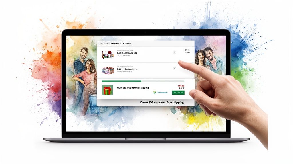
A great way to do this is with a tiered reward system built directly into the cart. This is where a dedicated tool becomes a game-changer. An app like Monster Cart, for example, can replace your standard cart with a dynamic engine that makes these rewards visual and interactive.
Here’s a perfect example of how Monster Cart turns a simple slide-out cart into an AOV-boosting machine with clear, gamified reward tiers.
See that progress bar? It visually motivates the customer by showing them exactly how close they are to unlocking their next reward. It’s simple, but incredibly powerful.
Smart Incentives That Actually Work
The key is to offer incentives that feel valuable to the customer but are cheap for your business. Big, flashy discounts should be your last resort, not your go-to strategy.
Here are some value-added rewards that get people to act:
Free Shipping Threshold: This is the undisputed champion of AOV boosters. A progress bar showing "You're only $12 away from free shipping!" is one of the most effective ways to get someone to add one more small item to their order.
Free Gift with Purchase: Offering a free product once a spend goal is met can feel way more exciting and memorable than a small percentage off. This is also a killer way to introduce customers to other products in your catalog.
Tiered "Buy More, Save More" Offers: This is the smart way to discount. Instead of a sitewide sale, you offer progressive rewards like "$10 off $100, $25 off $150." The structure itself encourages a higher spend.
Unlock Priority Shipping: For customers who want their stuff ASAP, offering a free upgrade to expedited shipping at a certain cart value is a fantastic perk that feels premium.
When you gamify the experience with a visual progress bar, the journey to unlocking these rewards feels like a fun challenge, not a sales pitch.
Strategic In-Cart Upsells and Cross-Sells
Once you've grabbed a customer's attention with a reward system, you have the perfect, low-pressure moment to show them relevant upsells and cross-sells. A dynamic cart lets you do this without being annoying.
For instance, you can pop a "Frequently Bought Together" section right below their items in the cart. If someone buys a camera, you suggest a memory card and a case. Because these recommendations are perfectly timed and shown in a frictionless environment, the take-rate is way higher than on-page pop-ups.
This is also the perfect place to offer low-cost, high-margin add-ons like:
Shipping Protection
Product Warranties
Priority Processing
These one-click additions can add up in a big way over time, boosting both your AOV and your overall profit margin. By turning your cart from a simple summary into an interactive profit center, you create a better user experience that also happens to grow your bottom line. It's a win-win.
Simplifying Checkout to Reduce Abandoned Carts
You’ve done all the hard work. You guided a customer from a social media ad, through your product pages, and all the way to the cart. The last place you want to lose them is at the finish line.
The checkout process is where a shopper's motivation gets tested one last time. Even the smallest bit of friction—a confusing form, a surprise fee, or a flicker of doubt—can send them running, leaving you with a heartbreakingly abandoned cart.
Getting this final step right is non-negotiable. The goal is to make paying so simple, fast, and secure that your customer sails through without a second thought. This is where you bulldoze every possible obstacle standing between their intent and your revenue.
Eliminate Unnecessary Friction
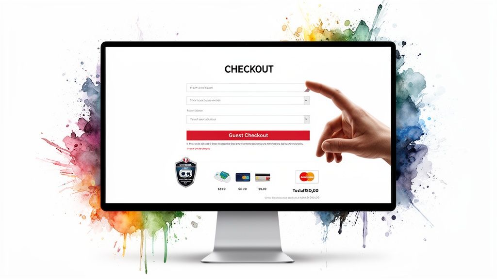
Every single field a customer has to fill out is another chance for them to quit. In a world of one-click buys, a long, multi-step checkout feels ancient and frustrating. Your job is to strip it down to the absolute essentials.
Start by looking at every single form field with a critical eye. Do you really need their phone number right this second? Can you combine "First Name" and "Last Name" into a single "Full Name" field? Trust me, each little simplification makes a real difference.
This is also why offering a guest checkout option is a must. Forcing a new customer to create an account before they can buy is one of the biggest conversion killers out there. Let them purchase effortlessly first; you can always invite them to create an account on the order confirmation page.
Embrace Express Payment Options
The fastest checkout is the one a customer barely has to think about. By integrating one-click payment methods and digital wallets, you let shoppers fly past all the manual data entry.
Shop Pay: For Shopify merchants, this is a no-brainer. It securely saves a customer's payment and shipping details, making checkout insanely fast across the entire Shopify network.
Apple Pay & Google Pay: These mobile options are incredibly familiar and trusted by users. They're a frictionless choice for anyone shopping on their phone.
PayPal: As a long-standing favorite, PayPal still offers a sense of security and convenience that millions of shoppers prefer.
When you display these familiar buttons right at the start of the checkout process, you’re giving customers an immediate easy button. This alone can seriously cut down your abandonment rate.
Build Trust at the Final Hurdle
The second a shopper gets ready to type in their credit card number, their sensitivity to trust signals skyrockets. Anything that looks unprofessional or insecure can trigger last-second doubt and kill the sale.
A seamless checkout isn't just about speed; it's about building confidence. By displaying trust badges and being transparent about all costs, you remove the psychological barriers that cause hesitation and lead to lost sales.
Make sure your checkout page reinforces trust in these key ways:
Display Security Badges: Feature logos from trusted names like Visa, Mastercard, and security seals like McAfee or Norton. They provide instant visual reassurance.
Reiterate Key Policies: A simple, one-sentence reminder of your return policy or satisfaction guarantee can provide that last bit of peace of mind.
Ensure Total Cost Transparency: Surprise shipping fees are the #1 reason for cart abandonment. Show the all-in final price—including taxes and shipping—as early as you possibly can. No sticker shock allowed.
By focusing on these details, you create a checkout that feels safe, simple, and respectful of your customer's time. This not only captures more sales today but also builds the foundation for loyalty and repeat business down the road.
To really dive deep into simplifying your checkout and minimizing lost sales, you can learn more about effective strategies for how to reduce cart abandonment. For more on this critical topic, check out our own detailed guide on how to reduce cart abandonment.
Common Questions About Ecommerce Optimization
Diving into ecommerce optimization can feel like you're trying to boil the ocean. With so many tactics to juggle—from site speed to checkout design—it's easy to get overwhelmed. I've been there.
To cut through the noise, I've pulled together answers to the most common questions I hear from store owners. This is the stuff that helps you sidestep the usual mistakes and apply these strategies with confidence.
What Is the First Thing I Should Optimize on My Ecommerce Site?
Before you do anything else, you have to nail site speed and the mobile experience. Full stop. These two things are the foundation for everything else.
Think of it this way: you wouldn't spend a fortune on interior design for a house with a cracked foundation. The same logic applies here.
If your pages are a nightmare to use on a phone or take forever to load, all the effort you put into beautiful product photos or slick checkout offers won't matter. A huge chunk of your potential customers will have already bailed out of sheer frustration. Get the fundamentals right first, and everything else you do will have a much bigger impact.
How Can I Increase My Average Order Value Without Using Discounts?
This is such a critical question, and getting it right is the key to building a genuinely profitable business. The answer is to stop thinking about hefty, site-wide discounts and start thinking about value-added rewards.
Constantly slashing prices is a race to the bottom. It erodes your margins and, worse, trains your customers to just sit back and wait for the next sale. A much smarter play is to offer a reward that feels earned.
The most effective way to do this is to offer something desirable once a customer's cart hits a certain threshold. It’s a gentle nudge that encourages them to add just one more item to unlock something special.
Instead of another 15% off coupon, try one of these:
Free Shipping Threshold: Seriously, "You're just $10 away from free shipping!" is one of the most powerful phrases in all of ecommerce.
Free Gift with Purchase: Getting a free product feels way more exciting and memorable than saving a few bucks.
Tiered Discounts: Smart, progressive discounts like "$10 off $100" encourage higher spending without giving away margin on smaller orders.
The goal here is to get you thinking about the long-term lifetime value of a customer. Rewards build loyalty and a positive feeling around your brand; constant discounts can just devalue your products over time.
This is exactly what tools like Monster Cart are built for. It can turn your standard cart into an interactive progress bar that visually shows shoppers how close they are to unlocking these rewards. It gamifies the experience, making it fun for them to spend a little more and boosting your AOV while protecting your profits.
Which Metrics Are Most Important for Measuring Website Performance?
You can drown in data if you're not careful. Getting lost in dozens of metrics often leads to "analysis paralysis," where you spend so much time looking at numbers you never actually do anything.
To get a clear, high-level view of your site's health and see the real impact of your work, just focus on these four core metrics to start:
Conversion Rate: The percentage of visitors who actually make a purchase. This is the ultimate report card on how well your site turns browsers into buyers.
Average Order Value (AOV): The average amount each customer spends per order.
Cart Abandonment Rate: The percentage of people who add items to their cart but leave without buying. This tells you where the friction is.
Page Load Time: How fast your pages load, especially on mobile. A slow site is a conversion killer.
If you track just these four numbers as you optimize your ecommerce website, you’ll have a powerful snapshot of what's working and where you need to focus next.
Does My Site Navigation Really Affect SEO?
Absolutely. Your site’s navigation is one of the most underrated—and most powerful—levers you can pull for SEO. A clean, logical menu and a smart internal linking strategy do a lot more than just help shoppers find their way around.
They also provide a clear roadmap for search engines.
When a crawler like Google can easily understand your site's hierarchy and see how your homepage, category pages, and product pages all relate to each other, it can index your content far more effectively. A good structure signals which pages are most important. This can lead to better rankings for your key commercial pages, driving more high-intent organic traffic straight to your products.
Ready to transform your cart from a simple summary into a powerful profit engine? With Monster Cart, you can build an engaging, in-cart reward system that boosts AOV without gutting your margins. Join over 7,000 Shopify brands and see how a smarter cart experience can delight customers and grow your bottom line. Learn more and get started at https://monsterapps.shop.
Join 7000+ brands using our apps


